

I warn you now that this is a blog post about paint; about one shade of blue in particular. It might even involve watching paint dry. Which, unless you are an artist, probably isn’t very exciting.
Paints represent a sort of non-verbal language for me. I actually find it hard to put into words how I feel about paints. I have a “feeling” in my stomach and I want to wave my hands about a bit to express those feelings, but it all seems very inadequate. I don’t know if other artists are like this. I see colours in life and think of the paints I might use to represent them on the canvas. There is a particular warm shade of brown that I am yet to satisfactorily find in a paint. For a long time, I struggled with particular shades of green, until I found that mixing turquoise produced the right level “zing” in my summer greens. In Donegal the greens need yellow ochre to make them ring true.

I am particularly obsessive about a particular colour that until yesterday, I was even sure how it was pronounced. This is phthalo blue. I doubt you have ever heard of it. It’s not like Ultramarine blue, made from lapis lazuli stone, which was was famously so expensive it was solely reserved for painting the Virgin Mary’s cloak.
Now, I am absolutely no good at saying words I haven’t heard someone else say out loud. That “ph” at the beginning really confused me and I used to call it “p-th-al-ff-oo” blue, deliberately tripping over the syllables because I’d never heard it said out loud. Until yesterday, when I realised I could look it up! So it did.
What! It’s pronounced “thalo”!! Why don’t they just call it Thalo Blue? I noticed in the comments below the video that someone else said ” I say it as pfthpfthpfthpfthpfthpfthpfthalo blue”. I don’t recommend, however, that you listen to the Russian pronunciation of “пхтхало блю” on google translate because it’s sort of like my original managling of the word!

You are probably thinking, who cares? Well, I care because I am passionate about Phthalo blue. No, that’s not true I am obsessive about it. It is very useful colour in my messy box of paints. I particularly like the version made by French paint manufacturers Lefranc & Bourgeois.

It’s not cheap but it a very useful colour. Its very strong. It’s very dark and I love it for creating really dark blues, blues that mixed with Van Dyke Browns and make wonderful dark clouds. I don’t like to use black for dark shades as it has a tendency to “kill” a colour. I have found that its essential for both the massive white Cumulonimbus clouds and the really filthy rain clouds of Donegal. It’s actually a synthetic pigment from the group of phthalocyanine dyes. When it’s mixed with Titanium white it makes a delightful light blue that’s also very useful for skies.


Oil paints are in essence pigments carried in oil (once upon a time vegetable oil was used) usually linseed today. The pigments were originally derived from mineral salts, a few from organic materials such as roots. Many of the historical pigments were dangerous, such as the wonderful greens called Paris Green (copper acetoarsenite) and Orpiment (arsenic sulfide), which were highly toxic. Happily, these pigments are no longer used. Later, man-made or synthetic, pigments increased the range of colors available, phthalo or phthalocyanine blue is one of these modern colours.
Chemists first developed this blue pigment in the late 1920s and it was sold under the trade name “Monastral“ in 1935. This list of alternative names is bewildering. Here are some of them; monastral blue, phthalo blue, helio blue, thalo blue, Winsor blue, phthalocyanine blue, C.I. Pigment Blue 15:2, Copper phthalocyanine blue, Copper tetrabenzoporphyrazine, Cu-Phthaloblue, PB-15, PB-36, C.I. 74160. I want to add to this long list of names Hoggar blue. Surprisingly, this colour is also used in Lidl’s Dentalux Total Care Plus toothpaste!
Now, I am sometimes faced with the situation that I have used up all the paint in a tube (and I really do get all the paint out of the tubes) but I can’t read the name or number of the paint to reorder the right one. I might be able to work out the manufacturer but its name or number. Here’s an example of what I mean.


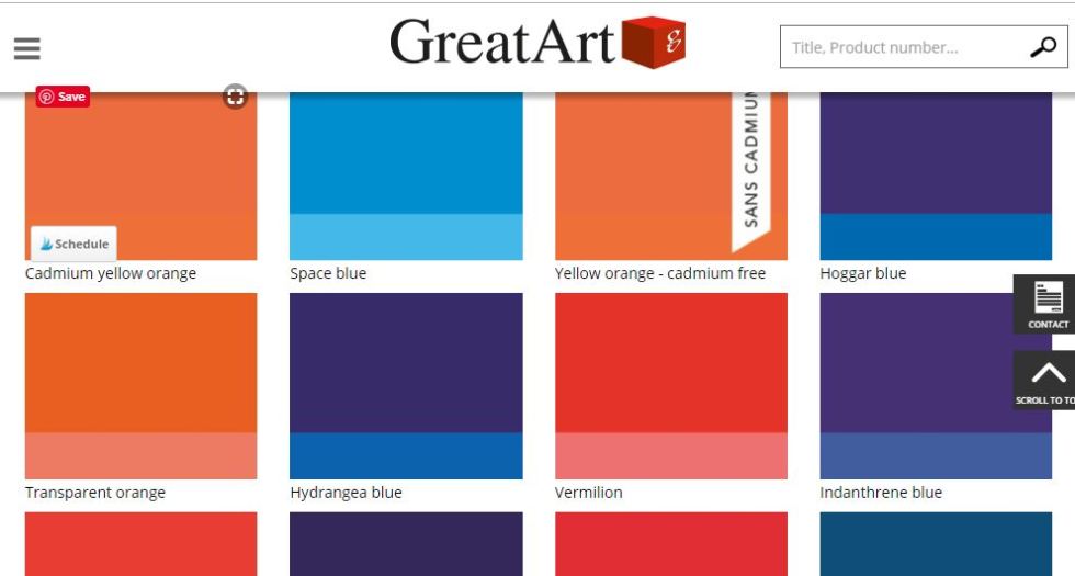
Lefranc & Bourgeois are the oldest artists’ quality colourmen in France. They share the same parent company as Winsor & Newton. This is why, it difficult to get their paints in the UK most stockists carry Winsor & Newton paints instead. A while back they decided to have a rebrand and they changed their labels and the names on the labels. This caused me great confusion because neither of the two suppliers where I usually ordered this great colour listed “phthalo blue” anymore. I’ll show what I mean. Here’s the Lefranc & Bourgeois page from the Great Art website.
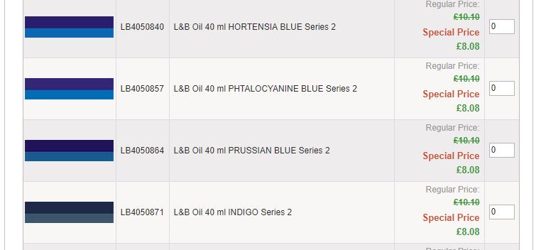
And here’s the page from L. Cornelissen & son in London:-
So I ordered a Phthalo blue made by another paint maker, Lucas 1862. It was OK but not half as good as the L&B version. It didn’t feel the same, and it didn’t mix with other colours in quite the way I wanted.

Looking back now, I can see that Hoggar Blue and Phtalocyanine Blue are actually the same colour, phthalo blue. The colour I thought they had stopped making. This meant I spent weeks eeking the last drop of paint out of the what I thought was my last tube, thinking that this colour was no longer to be had in the UK. Then I realised that I had another tube in a drawer so I got it out and studied the label carefully.

I realised that the names for this paint in other languages used Hoggar a lot (the Hoggar mountains are in Algiers, once a French colony); Blu Hoggar /Azul Hoggair /Hoggarblau so I went back and looked at the Great Art online catalogue and worked out that my phthalo blue was actually now listed as Hoggar Blue. So I ordered this Hoggar Blue and it was the same colour as Phthalo Blue. I was so happy! It meant that a part of my vocabulary was restored to me and I wasn’t going to run out of words!
So, you can see that I wasn’t exaggerating when I said I was obsessive about colour. Who else but an artist has a celebration over a particular shade of blue? The moral of the story is that all paint is not created equal and it’s always worth being obsessive about colour.

Oh yes, if you want to watch the video about paint drying, be my guest. I have watched and actually found it interesting (OK I actually skipped the drying bit to see the different colours)!