Ardara is pronouced “Arr-drahh” sort of prirate-like and not “Ar-dara”. It means Height of the Fort in Irish. I have heard Irish people (on the National TV weather forcast) get it wrong but they lived in far away Dublin. It is a busy little village near the Bluestack mountains in Donegal. Just over 700 people live there but thousands visit, especially in the summer time and many more pass through on the main road from North to South Donegal.
Map of Donegal – Ardara is to the South
Artie our cat from Ardara
Our cat, Artie, was once a stray in Ardara until the Animals in Need Donegal charity, trapped him, neutured him and found him a home with us. They had prioritised rehoming him rather releasing him back onto the mean streets of Ardara because long-haired cats find it difficult to get dry after rain and so they don’t live very long. Thankfully, he’s living a cushy dry indoor life with us and I hope he has a long life ahead of him.
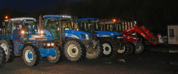
Ardara’s main street rolls down a long hill and turns right – then that’s about it. Before you know it you are back in the countryside. Like a lot of Donegal townlands, or villages, it is small but condensed. There is a lot in a small area. We had previously sat at a junction outside Ardara for 20 minutes and watched as what seemed like hundreds of tractors “zoom” past on a “Tractor Run”, a popular rural fun raising activity in Ireland (and Wales too). When I say “zoom” I mean relatively speaking, as a lot of the tractors were vintage ones that did not really zoom so much as chugg past.
The main street is dotted with lots of cafes, bars and wool/tweed shops. Ardara people are very friendly and welcoming. This is a regional centre for the dyeing and weaving of Donegal wool. This seemed to rub off choice of the colours of the walls of the village itself. The villages in the south of Donegal are a lot more colourful than the ones in the north. They favour white houses. I don’t know why, but I was surprised by the vibrancy of the colours of wool and cloths. They were the exactly same as the colours you see all around your in the Donegal landscape: greens of the grass, browns of the bogs, the pinks, purples, yellows and oranges of the flowers. Some cloths were flecked with an array of lush colours. As an artist it was very inspirational to see these colours.
A couple of years ago we visited the Triona Visitor Centre where a very patient lady answered a lot of my questions about weaving. There is also Campbell’s, Eddie Doherty’s and John Molloy’s to the south of the village. I would happily taken armfuls of coats and jumpers but in the end we limited ourselves to a tweed flat cap for Seamas and a pair of Donegal socks for me! Last of the big spenders, eh? This little village is well worth a visit and the list of upcoming festivals it hosts gives a good excuse call by if you are ever in the north of Ireland!
Just to let you know that I have extended my winter sale to 10th January – Join my mailing list and and get a code which allows 30% off the listed price! What a great way to start 2026!!
Worms Head (Rhossili) on Gower Peninsula by Emma Cownie
Clouds over Bannau Brycheinion (Brecon Beacons)
Summer in Mid Wales
Midsummer at Malin Head, Donegal- Emma Cownie
Marsh at Pennard Pill (Three Cliffs Bay, Gower) painting by Emma Cownie
Fishing Boat at Port Donegal-Emma Cownie
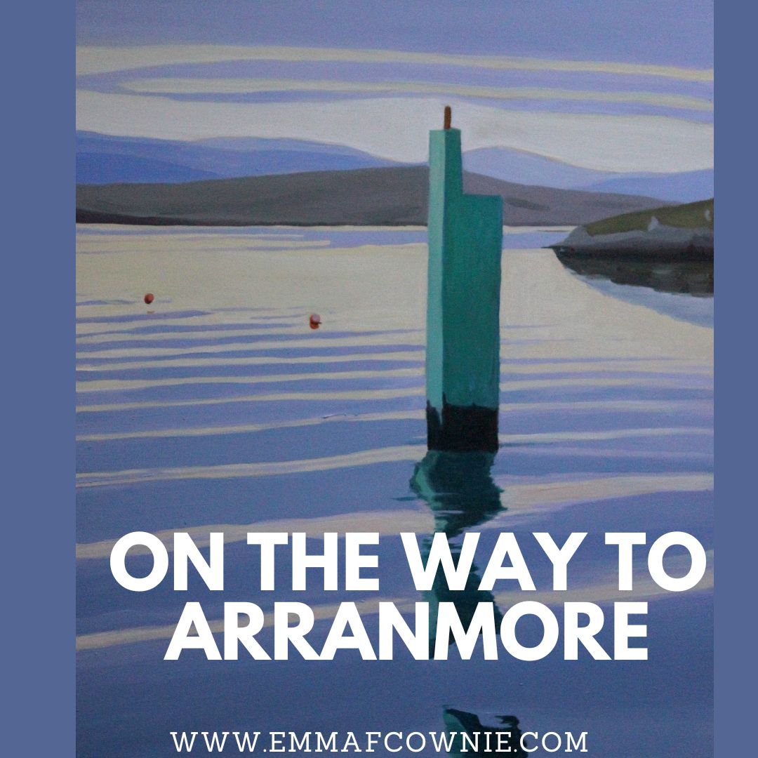
Lighting the way to Arranmore
John's Cottage, Malin Head, Donegal_Emma Cownie
Pen Y Fan from Usk Valley (Bannau Brycheiniog)
Tenby Terraces - painting by Emma Cownie
Stooknanillar, Inishowen (Donegal)-Emma Cownie
Wild Birds Video
It was freezing cold but the birds were very busy. There is a sign near by asking people not to feed the birds but the locals take no notice (note the bird feeder). I am glad because I loved watching the birds, especially the tiny coaltits. My camera work isn’t much good but at least you know its real and AI generated slop.
I am delighted to announce that I have made Jacksons Art’s extended long list for their 2024 Art Prize. The list was announced on 14th but as I didnt get an email from Jacksons, I assumed I hadn’t made the cut. So imagine my delight when I find a “Congratulations” email that isn’t telling me I have won a load of bitcoin has arrvived in my inbox.
It reads “With 12,964 entries submitted, from 129 countries, the selection process was incredibly competitive. As an artist on the Extended Longlist of 3,168 works, you are in the top 25% of entries. The full list is available to view here. ” I am on page 5 if you want to look.
Carn (Donegal) – Bridge Street in Carndonagh, Donegal
Update
The excitement only lasted a morning. Turns out that my email provider had hidden the “Congratulations” in a folder it calls “Promotions” which is mostly emails from Art suppliers. It had been there for a week before I spotted it. Strange how I had no problems seeing the “Thank you for Taking Part” email yesterday afternoon. Oh, well.
Have you seen this Apple advert? Take a moment to watch it. It makes my blood run cold. Surprisingly the tech bros at Apple thought it was a good idea to show this advert which depicts a tower of creative tools and analog items (like paint, trumpets and record players), being crushed into the form of the iPad. It’s a pretty grim vision of the future. It a good visual metaphor for what is happening to creatives right now.
This year has been the toughest year I have experienced as an artist, for a myriad of reasons, and the art market seems to be struggling generally. Yes there’s war in Ukraine and the Middle East (and elsewhere in the world) and “the Cost of Living Crisis” and terrible cold and wet weather in the British Isles hasn’t helped either.
It seems evident that it’s more difficult getting my work seen. I cant help but think that AI and the “enshitification of the internet” is at least partly responsible. I feel a bit like I am being slowly crushed by the Apple crusher. It’s sapping my creative juices. I don’t quite know what to do about it. Cory Doctorow explains how enshittification works “It’s a three-stage process: first, platforms are good to their users. Then they abuse their users to make things better for their business customers. Finally, they abuse those business customers to claw back all the value for themselves. Then, there is a fourth stage: they die.”
This is probably the reason why I can’t find any useful results on google – lots of top ranking website are full of AI nonsense. It’s also why fewer people are seeing my work on the internet. My posts are pretty much hidden on Facebook, Instagram and invisible on X. Images of my paintings do not show up on Google as much as they did say 3 or even 6 months ago. Many other artists report a similar decline in interest from potential customers.
I have started to visit my local library again in search of real books with in- depth facts. The only decent thing on Google these days is Wikipedia. I find that Youtube playlists are so random as to be useless and a search on Pinterest results in either pins I have seen before (in other words I have already saved them) or one unrelated to the search term I just used. Tech companies are burning up the planet with their massive data centres in the hope that one of them will “win” the AI battle and then charge us all for what used to be better quality and free.
What’s this got to do with you? Everything. Doctorow says that enshittification is coming for all industries. “From Mercedes effectively renting you your accelerator pedal by the month to Internet of Things dishwashers that lock you into proprietary dish soap, enshittification is metastasising into every corner of our lives. Software doesn’t eat the world, it just enshittifies it.” Think about your printer – a new printer is cheap as chips but the ink costs a fortune and you cant use non-proprietary ink and your printer will know, and refuse to work.
Corry Doctorow’s big hope is that “Stein’s Law will take hold: anything that can’t go on forever will eventually stop…if everyone is threatened by enshittification, then everyone has a stake in disenshittification.” Actually, there’s a lot more to it than that. You’ll have to read his articles to find out what USA and EU are planning to do to break the monopolies of the big tech comapnies.
I just hope that independent artists like me survive the process or else everyone will have to console themselves with souless AI-derived art their ipad/smartphone/tablet device instead.
See below for some scary examples of AI “Art”. It’s a nonsense view of Derry if you didn’t know.
“Painting of Derry City by Emma Cownie” – Thanks AI. I can give up now. NOT.
Just in case some of you are saying. It’s Londonderry not Derry. AI is no better at conjuring up a view of Londonderry. Take a look! Although there is a river this time.
“Painting of Londonderry City by Emma Cownie”
How about Three Cliffs Bay? I have painted that many times. Sure AI will do better at ripping me off. Well, no.
Painting of Three Cliff Bay by Emma Cownie – Yes, it looks NOTHING like Three Cliffs Bay
Yes, we can laugh at AI’s efforts and say they look nothing like those places or my paintings but it’s all doing damage. AI can never replace human creativity. AI cannot suffer and struggle like humans. It just produces a wierd pastiche of the thing it is meant to be. It’s expensive rubbish. It’s costing us dearly. Emissions from data centers of the likes of Google, Microsoft, Meta and Apple may be 7.62 times higher than they let on.
We can reverse the enshittification of the internet. Don’t accept those tracking cookies. Try a different search engine. Stay on the website rather than downloading apps (you can use ad blockers on the website you can’t on the app). Don’t buy everything via Amazon if you can buy it in a real life shop.
We can halt the creeping enshittification of every digital device. Put down your phone/tablet and read a book or look at a painting made by a real human being. Join artists’ mailing lists so you can still follow their work no matter what the big platforms do to hide their work.
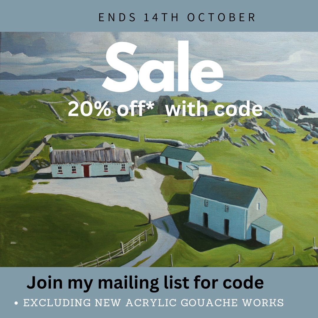
Oh, did I mention I have a 20% off sale on? Starting Sunday until Monday 14th. You have to join my mailing list for the code 20% code but you can unsubscribe at any time.
Here is the painting that finished me off. Now I look at it after a month, I am not sure why. I just felt like I had run into the sand and needed a change. I had been doing a lot of reading about composition but I suspect it had more to do with taking too long to paint. Acrylic paint often requires several layers to achieve the opacity of oil paint. I was getting bored and tired and I wanted to try something new. A change is a good as a rest.
Toralaydan Island, West Donegal
So I took a month off posting new work on facebook & instagram, to give myself head space. Some artists love being filmed live and showing their “process” – I am not like that. I get very self conscious and often will immediately screw up a painting if I take photos too early in its development. It’s one of the reasons I cannot bear to paint outside “en plein air” – people understandably want to see what you are painting and that makes me feel very self-conscious. I really dont know how people go on TV shows like “Landscape Artist of the Year” and produce really good paintings, or half-way decent paintings at all, in fact. They must have nerves of steel. I don’t. In fact, I know that many of my paintings can go through stages of looking quite rubbish before they (almost always) emerge butterfly-like from the murk and layers. It’s a lovely (and sadly rare) experience when a painting look interesting/beautiful all they way through the process of coming into being.
I had bought some tubes of Acrylic Gouache in the spring but had not got around to trying them out. Now I opened that box of paints and gave them my full attention. I had been looking for a water-based paint, to reduce the risk to my pets, especially my young inqusitive cats. I had had oil paint/white-spirit incidents with pets in the past when we had a lot more space and I did not want to take that risk now. I also wanted opaque paint. I had discovered that some American artists, whose work I liked, used Nova acrylics which is pretty opaque but they did not have a UK stockist. I was cautious about importing paints from the US as I once ordered a load of paint from a sale from JerrysArtsarama only to get stung by customs and VAT charges. So any saving I had made in the sale were wiped out! I also considered Golden SO FLAT matte acrylic paint but I am not a great fan of Golden colours. Dont get me wrong, some of their acrylic colours are great (light ultramarine for example) and I know many artists rave about them, but I don’t LOVE them. They were also sold in a jar rather than a tube, and I could just see me absent-mindedly sticking my dirty paint brush in a jar and mucking up the colour. I prefer tubes that I can squeeze a tiny bit of paint out onto my wet palette and keep my colours clean.
Not the set I bought – I wish!
I saw that Jacksons Art stocked Turner Acryl from Japan. I watched a couple of videos comparing different makes of Acrylic Gouache and liked the vibrancy of Turner’s paint. There is not a lot of information about acrylic gouache, unlike regular acrylic (I have several books on the technical aspects of using this acrylic). I keep reading the same thing – its a cross between gouache and acrylic. Gouache is a water-based paint which can be opaque (unlike water colours which are usually transculent) and it can be reactivated with water. Acrylic gouache, however, once dry, sets like acrylic and cannot be reactivated with water. It dries pretty quickly too. It dries to a smooth velvety matt finish too. It is used by illustrators, especially anime.
An example of anime art from Instagram from @happy.artistry
Look at the lovely rich colours!
The colours are lovely but I have a lot to learn. There are so many wonderful rich colours and I can see why these [paints are popular with illustrators. Unlike acrylics or gouache, there is little to no colour shift. It is non-toxic. It does not dry lighter or darker. I am finding this hard to get used too. I am overcautious about laying down darker colours. I have to learn this again and again. I often dont make my paintings dark enough as I am afraid the strong colour of the tarmac road will overwelm the painting. I have to repaint the shadows.
I feel out of control with it at times. Sometimes that is exciting, others just scary.
Winter Morning on Academy Road, Derry – Acrylic Gouache on wood Panel 2024 – An early effort
I painted a load of duff pieces before I started to feel I was getting somewhere with “Ardara”.
Ardara – Acrylic Gouache on Wood Panel 2024 – Another early effort
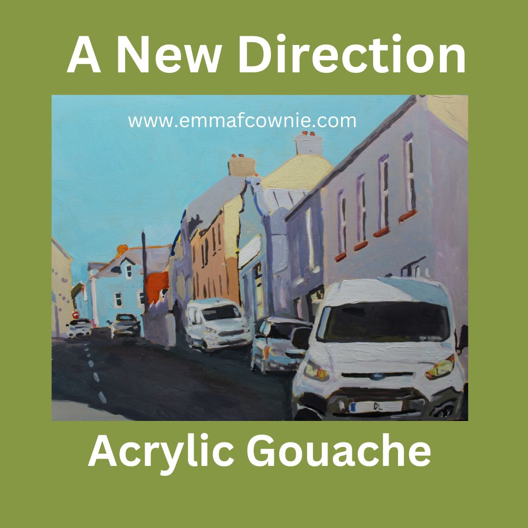
I felt that a new medium required new subject matter to set it apart from the rural scenes I had focused on since moving to Ireland in 2021. My work had previously described by Niall McMonagle in the Irish Independent as a “Clear bright glimpse of a vanishing Ireland”. I wanted to mix things up and paint a more contemporary version of everyday Irish life.
This meant scenes with cars. The Irish love their cars. I have painted cars in the past but not for a very long time. It was usually at night or in the rain (at night) so you could not really see them properly.
My Pop Art – The Driving Rain (SOLD) Oil on Linen Canvas, 2015
Coming out of Shell, Oil on Linen canvas (SOLD) 2020
It was in 2017 that I decided to pursue “Urban Minimalism” for my “Hollowed community” project for the MadeinRoath festival in Cardiff. For a long time, I have sought out empty scenes with no cars or people. It found it cleansing. The Morris Minor (below) was one of few exception to this. This vintage car was parked around the corner from our home in Brynmill. I used to hear the owner drive past our house on the way to the paper shop every morning.
Urban Minimal style – Morris Minor 2018 Oil on Linen Canvas (SOLD)
Now I decided on a volte face and to seek out street scenes with cars to challenge myself. Car are difficult to paint. I know some people will disagree with me, but in themsleves, they are not intrinsically beautiful, although the light reflected on their surfaces can be. I am more a fan of vintage cars like the Morris Minor and old-style minis (genuinely small cars) and enjoy the colours used by Italian manufacturers such as Fiat 500s. Too many cars in Ireland are black or grey. They don’t make for interesting compositions. Surprisingly, Lorries do. In the right place.
Deliveries on Queen Street, Derry – Acrylic Gouache on wood panel 2024
I wanted to paint with speed. I was bored of spending days or even weeks on a large painting. I wanted to work fast keep things fresh. I tried hard to resist overpainting. I left wobbly lines where possible so as to convey some of the energy of the urban areas.
Derry is a very lively city. I also wanted to explore town/city life on both sides of the border in Donegal and Derry, in Northern Ireland. The building stock is very different depending on which side of the border you are. The number plates maybe different but the cars are pretty similar.
Bogside, Derry – Acrylic Gouache on wood panel 2024
Light and shadows continue to be a theme in my work.
Carn (Donegal) – Acrylic Gouache on wood panel 2024
I have found this both challenging and exciting. I have produced quite a few paintings that didn’t work, especially at the start but I just pushed on. I knew that there would be a lot of wastage at the start. The only way I would get the hang of this medium was by painting a lot. I learn through my hands, mixing the paint and then placing the paint on the board. I have not yet achieved the consistency in my work I am used to with oils and acrylics.
I also had to deal with the fear that people might not like this style of paintings or the subject matter. That’s why I had to stay off social media until I felt like I knew what I was doing (sort of). I have shifted styles and subject matter before. There are themes I have focused on before and I am revisiting them. Others are constant – shadow and light. Strong dynamic compositions are also important.
I used to alternate larger landscapes with smaller people/animal paintings. This way I kept my interest in what I was painting. But I seem to get stuck painting landscapes when I came to Ireland. I am not sure it was good for me as an artist. I need to mix things up to keep them fresh. I don’t know where I am going with this but I feel I need to persue this trail for a while longer. I just have to keep going to see where I end up.
The name will be familar to British ears who ever listened to the daily shipping forecast on BBC Radio. It is broadcast late at night just before 1 am and very early (5.20am). Anyone who is a night owl or insominiac will have listened to it. The list of shipping zones and forecasts is not only practical but also poetic and rather mysterious. Following the litany of locations and numbers is very soporistic. Listen to the clip below. The actual broadcast is from 2.46 onwards ZZzzzzzzzzz
Shipping Forcast (1993) – almost always broadcast on the radio, you have to use your imagination!
Many British people may not know where Malin Head it is anymore than than they know the location of German Bight or Viking. To Irish ears, however, it is well-known as the most northerly tip of the island of Ireland and also features on Met Eireann’s, sea area forecast, broadcast on RTE.
UK_shipping_forecast_zones
Malin Head to Mizen Head
People regularly tranverse the length of Ireland from Malin Head, Donegal, to Mizen Head, Cork. It’s a fair stretch. Just under 400 miles (640 km). Some incredible people have cycled it in just over 15 hours. Ordinary mortals take about 4 days.
Amazingly some super-human runners have done it in about the same time – 4 days! I recently listened to a radio interview with the heroic Sophie Power. Sophie is from England and she recently ran the length of Ireland in under 4 days. This is a World Record. She beat the previouis record by three hours. Being a mother, she had to fit it in during her children half-term holiday and didn’t get to pick the day with the nicest weather – just the Tuesday of half-term and so she started off in driving rain! Many years ago I used to run (only piddly 10ks and 5ks) and I would certainly prefer to run in rain than heat.
Incredibly Sophie ran most of the distance without sleep, snatching the odd half an hour on her second and third day. She ended up hallucinating, and with a knee injury that had to be braced. When she finished the race in Cork she had developed heat stroke! That alone shows you how far south Cork is. There’s no way she’d get heat stroke in Donegal! She’s planning to come back and run the Cork Marathon.
Sophie Power at Malin Head
At the Edge of the world
Standing at Malin Head is like standing at the edge of the world. To the north is nothing can be seen but sky and sea. A long way off is Iceland and much. much further away to the north-west is North America. It feels very remote (but surprisngly accessible from Letterkenny and Derry/Londonderry) but to fishermen and sailors, I’m sure it’s not. Scotland is surpisingly close to the north-east. If you have ever flown from England to Belfast on a clear day, you can see the Scottish Isles and the Isle of Man scattered across the Irish Sea, pretty close the Antrim coast. Donegal is just a bit further along.
On the most northerly tip of the island of Ireland, you will find a tower that was built in 1805 during the Napoleonic wars as a lookout tower to defend against any attacks by the French. You can see at the top left hand side of my painting above. Edges of places are places to look out from – for invaders, or for incoming storms. Weather reports that were important to local and international shipping were first recorded at Malin Head in 1870. It was in that year the tower became a signal tower for Lloyds of London. Semaphore was used to connect with ships at sea and the lighthouse on nearby Inishtrahull. In 1902 the first commercial wireless message was sent from Malin Head to the S.S.Lake Ontario by the Marconi Company.
Divers’ magnet
There are the wrecks of many ships lying off the coast in this area. Many of these such as SS Audacious, SS Carthaginian and RMS Justicia date to the time of the First World War, when Ireland was still part of the British Empire.
In 1917 two German mines sankLaurentic and although her crew successfully abandoned ship, but 354 of them died of hypothermia in her lifeboats.Interestingly, Laurentic was carrying about 43 tons of gold bars when she sank. Most of the 3,211 bars were salvaged by 1924; three more bars were found in the 1930s, however 22 gold bars have still not been recovered.
The Great Emergency/Second World War
During the Second World War, Ireland was neutral. The Irish army built lookout posts in places along the coast to prevent any violation of this neutrality. This was important as this part of Donegal is so close to Northern Ireland, which not not neutral and was bombed by the Germans. There is an EIRE 80 sign built of stones during the war so aircraft would know that they were over Ireland (not Northern Ireland). They acted also as a navigational aid for pilots. Eire 79 is at Fanad Head to the west. Eire 81 is at Glengad Head, further along the Inishowen Peninsula, to the east. You can see it on the map below. The SS Athenia, a passenger ship carrying 1,418 people was torpedoed by a German U-boat just hours after war had been declared in 1939 off the coast of Malin Head! Most of the passengers survived but 117 perished.
Tourism Sign at Malin Head
Some scenes from the film Star Wars: The Last Jedi film was shot at Malin Head. I have to admit that I am not a Star Wars fan – I never made it through awhole film. I have to admit that I’m more of a Star Trek fan. Apparently, it is possible to have a tour of the locations used for the film from local tour guides. The road leading up to Bamba’s Crown has been renamed locally from the R242 to the R2D2 in recognition of the Star Wars connection. Also beside the tower, there is a short lovely refreshing walk along the cliffs to Hell’s Hole. The cliffs are massive here and even on a relatively calm day the sea is restless and a bit intimidating It needs to be remembered that this not just a sea here but an Ocean.
Birds Eye View of Malin Head, Donegal- Emma Cownie
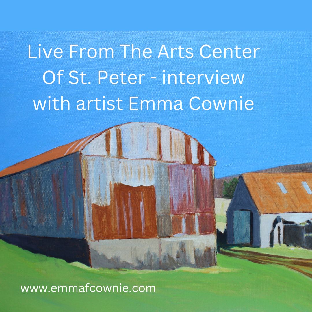
I did this interview back in March this year with artist and magician Michael Callahan and co-host Ann Rosenquist Fee, executive director of the Arts Center, St Pauls, Minnestota, USA. In it I talk about how I came to be an artist, my process, my love of colour and paint brushes!
Several years ago I embarked on what I called an “Urban Minimal“project; focusing on the streets of Brynmill, in Swansea, South wales, where we used to live. This work culminated in an exhibition in the Cardiff MadeinRoath festival (read more here).
My original “rules” for urban minimalism composition and painting
No cars
No People
Bright light. There must be shadows – at diagonals if possible.
Simplified forms – there must be little detail in the final painting. I found this the most challenging “rule” to stick to.
I am developing this approach with Derry. I like to paint relatively ordinary street scenes without people. The sunlight and the colours give them drama and beauty. Each of the painting is really about light. I am still attempting to simplify forms but this is something I am always failing at.
On the plus side, I think that my colours have become much softer and more subtle. I think this is partly a response to the northern light which is bluer and less golden than that in Swansea. Its is also because I have got better at achieving naturalistic colours. My confidence has also improved. In the past I chose brigher colours to make a painting more exciting.
I have slowly come to the realisation that such excitment is like hidden sugar in my food. Yes, its initially appealling but it can give you a bit of a headache!
I have enjoyed exploring the streets of Derry. I feel I know the place a bit better for painting them.
Eagle-eyed readers will spot a car in the mid-distance. I thought I’d see whether a car would negatively disturpt the composition. I don’t think it did.
Castle Street, Derry/Londonderry by Emma Cownie (acrylic on canvas)
Looking through my recent work, I was surpised to realise that I haven’t painted many paintings of Arranmore Island in the last couple of years despite visiting the islands in the summer. So I have put that right with a series of new paintings.
As always I am entranced by the journey to and from the island. You can read my short History of the Island here
Arranmore is lucky to be served by two ferry companies. There is The Arranmore Ferry (Blue) which is based on the island and Arranmore Ferry (Red) which is not. Yes, I know the names are almost identical, just a small matter of “The”. They both offer a fantastic 15 minute journey from Burtonport (Ailt An Chorráin) to Arranmore Island. On a calm and sunny day the view on the crossing are just heavenly. Sometimes there are dolphins too.
Map of Arranmore and the coast off Burtonport
The ferrys sail through a narrow passage past a scattering of islands on the way to Arranmore.
Rutland Island (Inis Mhic an Doirn) lies between Burtonport and Arranmore, Donegal. William Burton Conyngham (a local landowner for whom Burtonport takes its Anglised form) had warehouses, a street of houses, a post office and a school built c. 1784 to capitalised on a the abundant herring fishing. Unfortunately, the herring disappeared very early in the 1800’s and the station fell into disuse. The island was inhabited until the 1950s. These are the remains of the fish factory and landing stage on Rutland Island.
Opposite is Inishcoo Island with Mount Errigal in the distance peeping out from under the clouds. The jetty in the left hand corner belongs the magnificent Inishcoo House (see painting below)- once a coast guard house, built in the C18th.
Inishcoo House, Ireland (SOLD)
There are several tiny holiday homes dotted across the islands (and cows)
Ferry Home (Arranmore, Donegal) by Emma Cownie SOLD
A you can see the views are quite idyllic. Whether from the ferry or from the island. To be honest, I wish the ferries were like the Circle Line on the London Underground, where you can ride the tube rround and round (it takes and hour and an half apparently, I have never done it) and you could ride them back and forth to the island all day!
Washing Line, Arranmore by Emma Cownie SOLD
Some more recent works….
A Home on Arranmore, West Donegal, Ireland by Emma Cownie
You probably think that artists are good at creating paintings/images in all mediums; oil, watercolours acrylic paints. Many probably are, but I am not. I need to work at it. It’s a bit like being an athlete. You might be great at football but it doesn’t automatically mean you are a great sprinter, tennis player or swimer. Although there are athletes who have successfully switched disciplines, like Usain Bolt, who started his career as a footballer; extra training is needed. I think painting is like that.
Almost all of my experience up to now has been in working with oil paints but in the last six months I have been working hard at painting in acrylics. Why? I knew that in our small house in Derry, until we got stairs put into the attic space, that oil paints and with their associated mess and fumes weren’t going to work.
Unfortunately I feel like I have been hitting my head against a brick wall for several months. I have learnt a great deal, using acrylic mediums and varnishes is very technical, but I won’t go into all the detail of what I have learnt. The strange thing is that the finished paintings looked good but the process of creating them was slow and frustrating. Here are some early examples;
Shadow on the Entrance, Bloody ForelandHouse on Inishbofin
This last one is my favourite but it took weeks to complete rather than days. I just don’t have the patience to spend that long on one smallish painting.
I also used acrylic paint for underpaintings for my oil painting, which worked better for me. It enabled be to paint faster, but this approach would be no good in Derry where I couldn’t use oil paints.
Boat at the Pier, Gola (Donegal)From Magheraroarty to Muckish (Donegal)
So why was I taking so long to complete these acrylic paintings? Acrylics don’t act like oil paints, that can be a good thing as well as a bad thing. You can correct mistakes easily. Acrylic paint is a relatively recent invention of the 1950s. It’s essentially a plastic. It is amazingly versatile but it’s origins as a polymer presents a couple of challenges that I have struggled with for some time. The first issue is that it dries fast. Really fast. I found that it dried on my palette within minutes. I hate wasting paint, so I made my own wet palette, so that the paint on my palette dries within days and not minutes.
It still dried very fast on the board/canvas on which I was painting. That meant that large areas, such as skies, werevery difficult to paint without looking patchy. I learnt to mix up large quantities of paint so that if I needed to, I could repaint a small area of the sky. Otherwise, the whole sky had to be repainted.
The second big issue I had was somehing called “colour shift”. Acrylic paint dries dark. This is because most makers of acrylic paint use white binder that dries clear, so it looks light when you apply it, but goes dark as it dries. It seems to affect blues and browns particularly badly. I tried painting patches of colour to see who was the worst offender.
Colour Shift (these are all dry so you cant see the colour shift but my notes tell you what I saw)
Although Windsor & Newton’s paints use clear blinder and have little colour shift, I didn’t particularly like them as a paint. I am not sure why I didn’t like them, possibly I just prefered to colour range of other manufacturers. Anyway, in the end I bought lots of Schminke PrimAcryl paints which also use a clear binder and results in only a small colour shift.
Finally, I decided to experiment with indirect painting. This is a method where by an underpainting in grayscale is done first and light layers of colour are applied as a glazes.
Again, its’s not as speedy as painting in oils (although I have used brown-tonal underpaintings in the past – with oil paintings, see here).
So here are two paintings I painted tonal underpaintings, and then added colour through a series of glazes.
Greyscale study of lambing Season at Fanad HeadWork in Progress – Lambing season at Fanad Head
Lambing season at Fanad Head (Donegal) – Final version
Greyscale study of Fanad Lighthouse – painted on a blue ground, which I left in the sky area of the painting.
Almost done – Fanad Lighthouse (Donegal)Lighthouse at Fanad Head (Donegal) – Final version with lightened sky
This approach seemed to work well for acrylics. Although I am still not as quick as I am in oils, this process enables me to produce paintings with greater depth of colour and more accurate tonal values. It is especially good for getting distant mountains right, something I have struggled with in the past. I am hoping that I have finally got the hang of working with this medium. I think it’s the end of the beginning rather than the beginning of the end. There’s always so much to learn with painting no matter which medium you use!