It’s not until you film yourself painting that you realise just how long a painting takes. I *know* how long they take, usually several days, sometimes longer. Actually seeing the process makes you realise how painstaking and slow the whole process is. Its taken me a while how to work out how to do a timelapse film and its a joy to see the work “fly” along. This is how it feels to me as I am painting (when its going well). Of course, a film can’t capture all the standing back, breaks to change the water, to clean the palette, or just to *look* at the painting. That is a dedicated painting shirt, by the way. There’s a lot of paint on the front of it.
Nellie had been lying on the bed whilst I was painting and came over when I put the palette down. Flossie and Nellie have always taken a great interest in my painting. So much so that I have been reduced to using a small camping stool as they insisted on walking along the back of the chair I used. My water is in a small jam jar with a scew-on lid as Nellie frequently tries to drink the (probably toxic) paint water if I leave it unattended. The palette also has a lid to help keep it damp and keep playful paws away from the paint. They are a large part of the reason I paint in water-based acrylic paints these days instead of oils.
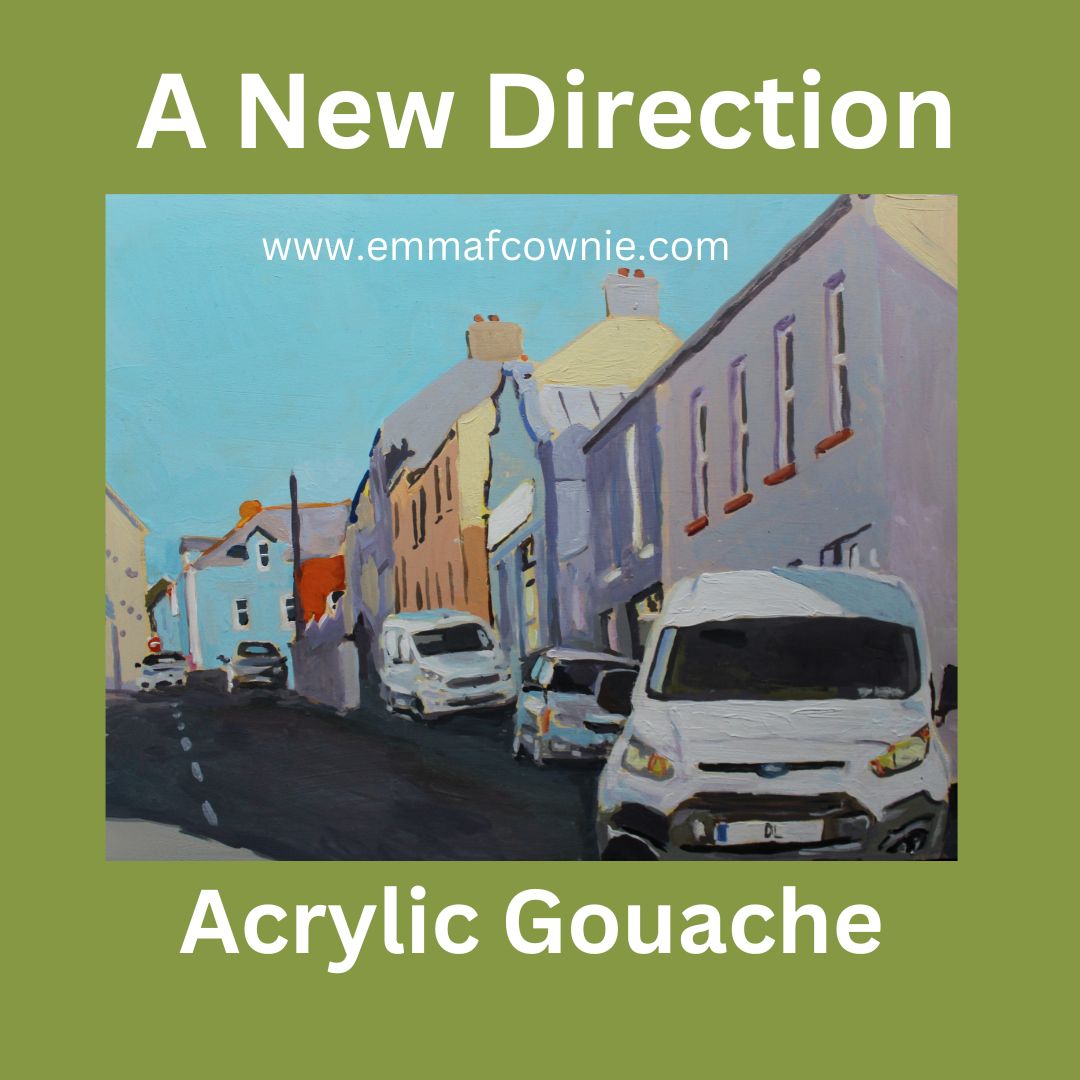
Here is the painting that finished me off. Now I look at it after a month, I am not sure why. I just felt like I had run into the sand and needed a change. I had been doing a lot of reading about composition but I suspect it had more to do with taking too long to paint. Acrylic paint often requires several layers to achieve the opacity of oil paint. I was getting bored and tired and I wanted to try something new. A change is a good as a rest.
Toralaydan Island, West Donegal
So I took a month off posting new work on facebook & instagram, to give myself head space. Some artists love being filmed live and showing their “process” – I am not like that. I get very self conscious and often will immediately screw up a painting if I take photos too early in its development. It’s one of the reasons I cannot bear to paint outside “en plein air” – people understandably want to see what you are painting and that makes me feel very self-conscious. I really dont know how people go on TV shows like “Landscape Artist of the Year” and produce really good paintings, or half-way decent paintings at all, in fact. They must have nerves of steel. I don’t. In fact, I know that many of my paintings can go through stages of looking quite rubbish before they (almost always) emerge butterfly-like from the murk and layers. It’s a lovely (and sadly rare) experience when a painting look interesting/beautiful all they way through the process of coming into being.
I had bought some tubes of Acrylic Gouache in the spring but had not got around to trying them out. Now I opened that box of paints and gave them my full attention. I had been looking for a water-based paint, to reduce the risk to my pets, especially my young inqusitive cats. I had had oil paint/white-spirit incidents with pets in the past when we had a lot more space and I did not want to take that risk now. I also wanted opaque paint. I had discovered that some American artists, whose work I liked, used Nova acrylics which is pretty opaque but they did not have a UK stockist. I was cautious about importing paints from the US as I once ordered a load of paint from a sale from JerrysArtsarama only to get stung by customs and VAT charges. So any saving I had made in the sale were wiped out! I also considered Golden SO FLAT matte acrylic paint but I am not a great fan of Golden colours. Dont get me wrong, some of their acrylic colours are great (light ultramarine for example) and I know many artists rave about them, but I don’t LOVE them. They were also sold in a jar rather than a tube, and I could just see me absent-mindedly sticking my dirty paint brush in a jar and mucking up the colour. I prefer tubes that I can squeeze a tiny bit of paint out onto my wet palette and keep my colours clean.
Not the set I bought – I wish!
I saw that Jacksons Art stocked Turner Acryl from Japan. I watched a couple of videos comparing different makes of Acrylic Gouache and liked the vibrancy of Turner’s paint. There is not a lot of information about acrylic gouache, unlike regular acrylic (I have several books on the technical aspects of using this acrylic). I keep reading the same thing – its a cross between gouache and acrylic. Gouache is a water-based paint which can be opaque (unlike water colours which are usually transculent) and it can be reactivated with water. Acrylic gouache, however, once dry, sets like acrylic and cannot be reactivated with water. It dries pretty quickly too. It dries to a smooth velvety matt finish too. It is used by illustrators, especially anime.
An example of anime art from Instagram from @happy.artistry
Look at the lovely rich colours!
The colours are lovely but I have a lot to learn. There are so many wonderful rich colours and I can see why these [paints are popular with illustrators. Unlike acrylics or gouache, there is little to no colour shift. It is non-toxic. It does not dry lighter or darker. I am finding this hard to get used too. I am overcautious about laying down darker colours. I have to learn this again and again. I often dont make my paintings dark enough as I am afraid the strong colour of the tarmac road will overwelm the painting. I have to repaint the shadows.
I feel out of control with it at times. Sometimes that is exciting, others just scary.
Winter Morning on Academy Road, Derry – Acrylic Gouache on wood Panel 2024 – An early effort
I painted a load of duff pieces before I started to feel I was getting somewhere with “Ardara”.
Ardara – Acrylic Gouache on Wood Panel 2024 – Another early effort
I felt that a new medium required new subject matter to set it apart from the rural scenes I had focused on since moving to Ireland in 2021. My work had previously described by Niall McMonagle in the Irish Independent as a “Clear bright glimpse of a vanishing Ireland”. I wanted to mix things up and paint a more contemporary version of everyday Irish life.
This meant scenes with cars. The Irish love their cars. I have painted cars in the past but not for a very long time. It was usually at night or in the rain (at night) so you could not really see them properly.
My Pop Art – The Driving Rain (SOLD) Oil on Linen Canvas, 2015
Coming out of Shell, Oil on Linen canvas (SOLD) 2020
It was in 2017 that I decided to pursue “Urban Minimalism” for my “Hollowed community” project for the MadeinRoath festival in Cardiff. For a long time, I have sought out empty scenes with no cars or people. It found it cleansing. The Morris Minor (below) was one of few exception to this. This vintage car was parked around the corner from our home in Brynmill. I used to hear the owner drive past our house on the way to the paper shop every morning.
Urban Minimal style – Morris Minor 2018 Oil on Linen Canvas (SOLD)
Now I decided on a volte face and to seek out street scenes with cars to challenge myself. Car are difficult to paint. I know some people will disagree with me, but in themsleves, they are not intrinsically beautiful, although the light reflected on their surfaces can be. I am more a fan of vintage cars like the Morris Minor and old-style minis (genuinely small cars) and enjoy the colours used by Italian manufacturers such as Fiat 500s. Too many cars in Ireland are black or grey. They don’t make for interesting compositions. Surprisingly, Lorries do. In the right place.
Deliveries on Queen Street, Derry – Acrylic Gouache on wood panel 2024
I wanted to paint with speed. I was bored of spending days or even weeks on a large painting. I wanted to work fast keep things fresh. I tried hard to resist overpainting. I left wobbly lines where possible so as to convey some of the energy of the urban areas.
Derry is a very lively city. I also wanted to explore town/city life on both sides of the border in Donegal and Derry, in Northern Ireland. The building stock is very different depending on which side of the border you are. The number plates maybe different but the cars are pretty similar.
Bogside, Derry – Acrylic Gouache on wood panel 2024
Light and shadows continue to be a theme in my work.
Carn (Donegal) – Acrylic Gouache on wood panel 2024
I have found this both challenging and exciting. I have produced quite a few paintings that didn’t work, especially at the start but I just pushed on. I knew that there would be a lot of wastage at the start. The only way I would get the hang of this medium was by painting a lot. I learn through my hands, mixing the paint and then placing the paint on the board. I have not yet achieved the consistency in my work I am used to with oils and acrylics.
I also had to deal with the fear that people might not like this style of paintings or the subject matter. That’s why I had to stay off social media until I felt like I knew what I was doing (sort of). I have shifted styles and subject matter before. There are themes I have focused on before and I am revisiting them. Others are constant – shadow and light. Strong dynamic compositions are also important.
I used to alternate larger landscapes with smaller people/animal paintings. This way I kept my interest in what I was painting. But I seem to get stuck painting landscapes when I came to Ireland. I am not sure it was good for me as an artist. I need to mix things up to keep them fresh. I don’t know where I am going with this but I feel I need to persue this trail for a while longer. I just have to keep going to see where I end up.
This is a postscript to my post earlier this month about Malin Head. It was a beautiful sunny day there today. Summer has arrived in Donegal. Who know how long it will last so everyone was out!
I met brothers Harry and Kit (Dr) Lawrence just after they had laboured up the steep hill to Malin Head Tower on their bikes, laughing as they finished.
“We have just finished a thousand km cycle ride from Mizen Head!” Annouced Harry to no one in particular and anyone who could hear.
“Congratulations” we said and I shook their hands (me and some motorcyclist tourists).
The brothers had taken just 8 days to ride from Mizen Head in Cork to Malin Head today. I told them about Sophie Powers who had done it in 4 days with very little sleep. They had had sleep and no back up team. Just two panniers with their spare clothes in. They were not expert cyclists. Kit proudly told me that he’d bought his bike on Gumtree for £100 last month. It was clearly a massive bargain as it did the job very well indeed. They raised over £2000 for the Samaritans. I couldn’t have done that in 80 days never mind 8 days! Well done!
Just arrived at Malin Head
Harry and Kit Lawrence at Malin Head with that bargain bike
I have been suffering from writer’s block. I started this post in March this year. I keep writing, rewriting it and then not publishing it. The problem isn’t that I don’t have any thing to say. It is more that I have too much to say and I didn’t know where to start or how to structure what I want to say. It’s not about paint but thread and wool. I have been on a bit of an artist’s journey. It’s been quite a meander; off my usual painting path. I am not sure if it’s a dead end, another fad.
Sewing materials – wool and floss – such lovely colours!
I discovered that here In the north of ireland it doesn’t start to get light here until after 9 am in the deepest winter and painting light often “goes” by 1 or 2pm. There wasn’t going to be a lot of time for painting. So I decided I needed another creative outlet to persue along side the painting to do in the hours of gloomy light and nights, under artifical light. I thought about sewing.
A certain photo haunted me. I had taken it back in Swansea before we moved over to Ireland. I was going through the exhausting process of sorting through my stuff and deciding what I could keep and what should go. I came across this moth-eaten piece of fabric. It was a piece I made in junior school. I took a photo of it. It’s not well made at all but I liked its carefree style and slightly chaotic composition. The moths had made quite a meal of it. .Those elephants once all had eyes. I enjoyed the bold colours It got me thinking. Embroidery/sewing was something creative I could do under artificlal light.
An Early Cownie Tapestry
So I gave up trying to paint under artifical light in the mornings and evenings. Instead I took up sewing and embroidery. I have always liked the vibrant colours of embroidery floss. However, I found that it occupied my thoughts a lot of the time so much so that it was difficult to concentrate on my day time painting. I suppose the issue was that although I enoyed the action of sewing, I didn’t quite know in which direction to go with what I doing with it. It was slow and time-consuming and what I produced was small-scale. I was also torn between learning and practicing different stitches and what to do with them. Quite possibly this is an conundrum at the heart of all creative endeavours.
That delicate balance between skill and expression. If I make something without much skill it will just be crude and amateurish? If I make something that it is skillful – it may well have less personality and expression. And for that matter, as an artist, how do I feel about possibly straying into the world of “craft”? A world that is largely populated by women and with less status than art?
But what’s the difference between Art and Craft anyway? Good question. Like all lazy writers I looked it up on Google: ” Art is described as an unstructured and open-ended form of work; that expresses emotions, feelings, and vision. Craft denotes a form of work, involving the creation of physical objects, by the use of hands and brain. Art relies on artistic merit whereas craft is based on learned skills and technique.” So I was onto something. If I get too skillful at embroidery I am in danger of verring off into the world of craft. That’s worth bearing in mind although there’s little danger of me becoming too skillful.
Intially I lacked confidence, I collected images in a scrap book and on Pinterest and my early pieces aped people whose work I liked. I spent the winter admiring the work of many textile artists – the ones that come to mind right now are Sue Stone, Mandy Pattullo, Ann Smith (Persimonstudioart) as well as Japanese applique artists Mika Harasa and the incredible Ayako Miyawaki.
Stitch Portrait of Seamas
I was like a child in a sweet shop, verring off in first one direction than another. First I tried to copy the style of Sue Stone for a stitch portrait. I discovered that stitching a face is very much like drawing or painting a face, tiny details matter.
Then a bird inspired by the work of Mandy Pattullo and Ann Smith.
Embroidery bird on a cushion
I wasn’t particularly happying copying other people’s style but I had to start somewhere. I couldn’t decide. The choice was bewildering. Was it line, colour, texture that I liked? Yes, yes, yes. I liked it all! I then tried freestyle style stitching in the hope that it would express my personal style. well, no. It got too chaotic. I enjoyed the mechanical action of sewing by hand. I tried dry felting and although my husband liked the chaos, I didn’t.
Freetyle Stitching
Dry Felting – House on Arranmore, Donegal
I wan’t sure if all this was coming from me or was just a mish mash of other people’s work. I needed a greater sense of control over what I was doing. I had to pause. I decided to rein it all in and try simple stitches again although I often prefered the messy underside of the work. Why is that?
The “wrong side” of the sparrow embroidery
I tried to explore the texture of birds feathers a little more.
Embroidery Robin – unfinished
Finally, I came around to a way of working that seemed to be a decent expression of my work in paint. I started getting where I wanted to go. The ancient and humble chain stitch. Turns out that the chain stitch is one the oldest and most widely known stitches in existence. Examples have been found in Egypt on textiles from Tutankhamun’s tomb, dated to the 14th century BC; on embroideries found in Pazyryk tombs dating from 4th-3rd century BC (excavated in southern Siberia but probably originating in China). I enjoyed it’s texture and it’s ability to fill space with colour.
I started with a semiabstract flower design based on a painting I had done many years ago.
Then I decided to try some Irish scenes. that I had painted. These satisfied me the most.
House on Inishbofin – Emma Cownie
Painting and Embroidery “House on Inishbofin” – Emma Cownie
Chain Stitch Embroidery – House on Gola
Me stitching – observed by my loyal helper cat, Tiffany. Embroidery travels well but pointy scissors and planes dont mix. I had my snippers conviscated!.
The work is maddenly slow but strangely therapeutic. There is something very compulsive about filling the space with colourful stitches. I enjoy running my fingers over the stitches. It also mad me think about what could be simplified into an embroidery an what sort of details could and could not be rendered in chain stitches. Getting the right colour thread was difficult at times. I made mistakes – a brown shadow rather than a bluish one. I tried to be accurate but somes I was forced to compromise, sometimes I just got it wong.
So now I have a small collection of tapestries very fond of in an in formal display in my living room. it’s been an interesting journey but I am not sure if its a cul-de-sac or “Grist-to-the-mill” part of a creative process. Maybe the reall problem is that I discovered that it was difficult to sew by hand under artifical light and the embroidery was competing with painting for useable daylight. It was a joy to return to speedy paint when the light improved. So, embroidery has drifted off into a bit of a back-water for the time being although I still have a couple of projects on the go.
I was delighted to see my two Donegal paintings “Up Bloody Foreland, Donegal” and “The through Road, Donegal” on the walls of the London Irish Centre (Camden, London).
These two oil paintings form part of a “real room” of an Irish family in 1950s Britain installation. The exhibition, which is on during August through to October, pulls together a dynamic collection of prints, photographs, paintings, and writings that weave together the different threads of ‘Home’ for Irish Immigrants to London. This has been organised Tara Griffin, who is Education and Heritage Officer at the London Irish Centre, in conjunction with the Museum of the Home. It looks fascinating and I hope my paintings bought happy reminders of home to visitors to the centre. My work has been described as nostalgic by by some and I am interested in capturing a vanishing Ireland of the not too distant past. I just wish I could have visited in person!
There’s a good reason why landscape painters use the “landscape” orientation for their canvases – i.e. the longest side is horizontal – and that’s because you can fit more landscape in that way. I have recently discovered another good reason – social media and wordpress thumbnails don’t like tall narrow paintings and will automatically crop them. This one-size fits all is especially irritating in the case of my most recent painting below, as the thumbnail cuts out the focus of the painting – Con Herron’s farm at the foot of the massive hill – Scraigs, which is part of the Bluestack Mountain range in Donegal.
So looking at the thumbnail you just see the top of the mountain! I am pretty sure than no one will be clicking on that to see the full size image. It’s no better on pinterest!
Top of the moutain – Thumbnail
So I have had to play around and put the image on a backing to widen it.
Scraigs, Fintown – extra background added on Canva.com
I also use mock up software (from Canvy.com) to get a sense of the scale of the painting.
Mock up from Canvy.com
Another Mock up from Canvy.com
Map of Scraigs and Bluestacks – ignore the red route. Fintown is at the top of the map.
I often look at the rocky tops of the mountains and hills in Donegal and wonder how often, if ever, they are climbed by people. The farmers in the past must have been incredibly fit (modern day ones surely use quad bikes) as I am often surprise to see fencing winding its way over the top of these craigs. I look up the Scraigs on the internet and find that it features on a website called “Mudsandroutes.com” with a summit map but no one has yet written a review of their climb. So I suppose intrepid climbers must ascended that craggy summit but probably not from this angle! There seems to be an easier route from the western side.
Herron’s Farm, Fintown Donegal-Emma Cownie
If you ever get the chance to read the “Tales from the Bluestacks” or “The Hills: More Stories from the Bluestacks” a collection of short stories published in the 1980s by American academic-turned sheep farmer Robert Bernen, they are well worth the effort. He and his wife lived in the Croaghs in the 1970s. I grew up in the 1970s and 1980s so it doesn’t seem so long ago to me but his stories, such as the coming of motor vehicles and later on electricity to the area, reveal a way of life that has now pretty much vanished. I like to think that 92 year old Con Herron, whose farm lies that the bottom of my painting, was part of that world.
Read Irish Times article on Robert Bernen and farming life in the Blustacks here – worth it for the photgraphs of the interiors of the irish houses alone!
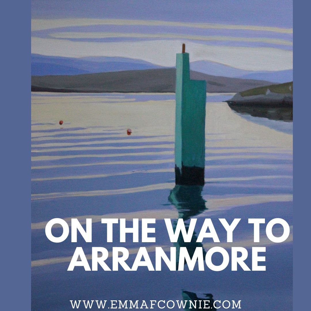
Looking through my recent work, I was surpised to realise that I haven’t painted many paintings of Arranmore Island in the last couple of years despite visiting the islands in the summer. So I have put that right with a series of new paintings.
As always I am entranced by the journey to and from the island. You can read my short History of the Island here
Arranmore is lucky to be served by two ferry companies. There is The Arranmore Ferry (Blue) which is based on the island and Arranmore Ferry (Red) which is not. Yes, I know the names are almost identical, just a small matter of “The”. They both offer a fantastic 15 minute journey from Burtonport (Ailt An Chorráin) to Arranmore Island. On a calm and sunny day the view on the crossing are just heavenly. Sometimes there are dolphins too.
Map of Arranmore and the coast off Burtonport
The ferrys sail through a narrow passage past a scattering of islands on the way to Arranmore.
Rutland Island (Inis Mhic an Doirn) lies between Burtonport and Arranmore, Donegal. William Burton Conyngham (a local landowner for whom Burtonport takes its Anglised form) had warehouses, a street of houses, a post office and a school built c. 1784 to capitalised on a the abundant herring fishing. Unfortunately, the herring disappeared very early in the 1800’s and the station fell into disuse. The island was inhabited until the 1950s. These are the remains of the fish factory and landing stage on Rutland Island.
Opposite is Inishcoo Island with Mount Errigal in the distance peeping out from under the clouds. The jetty in the left hand corner belongs the magnificent Inishcoo House (see painting below)- once a coast guard house, built in the C18th.
Inishcoo House, Ireland (SOLD)
There are several tiny holiday homes dotted across the islands (and cows)
Ferry Home (Arranmore, Donegal) by Emma Cownie SOLD
A you can see the views are quite idyllic. Whether from the ferry or from the island. To be honest, I wish the ferries were like the Circle Line on the London Underground, where you can ride the tube rround and round (it takes and hour and an half apparently, I have never done it) and you could ride them back and forth to the island all day!
Washing Line, Arranmore by Emma Cownie SOLD
Some more recent works….
A Home on Arranmore, West Donegal, Ireland by Emma Cownie
This section is more about how I work, my style and influences.
Q: How do you choose your places to paint? And is there a particular time of year that you favour?
A: Light and colour draw me to a subject. I am looking for a strong composition and clean colours. Usually bright light and strong shadows, so any time of year except for summer. I paint large paintings in the long hours of summer instead. Composition is key to my work. I also like to express the quiet like various American realists like Edward Hopper. I also love Rockwell Kent, a painter who also painted west Donegal.
Q: Do you work en plein air? From sketches? Photographs?
A: I tried painting en plein air in South Wales – I was crippled by feeling self-conscious and frustrated by my lack of control over the conditions. Plein air is also not conducive to my style of painting, and what I am trying to achieve in my work; in the magnification of simplicity, form, light and shadow. I am continually painting layers over a period of time. My creative process starts with taking the photo, editing and then using it for inspiration. I try to recreate the essence of a place I am painting rather than simply reproducing a scene. I am very much influenced by the photography of Henri Cartier-Bresson and how he used composition to create dynamic images.
Henri Cartier-Bresson, County Kerry, Ireland, 1952
Q: You now live in Derry and Donegal. How did that come about?
A: We wanted to have a combination or urban and rural so that we could experience both, so we live 7/8 months of the year in Derry and 4/5 months in Donegal. The Derry/Donegal combo is hard to beat. Derry also opens up another area of east Donegal, Inishowen, as it is only a few miles away from Derry city.
Q: Your work features on a Donal Ryan Spanish version of Strange Flowers [‘Cottage on Bunbeg Harbour’] and Claire Keegan’s Foster [‘The Traditional House. Gola’]. Congratulations. Has that made a difference?
A: It has been great to get recognition from two such brilliant writers. I feel greatly honoured. I knew that when I moved from South Wales to Ireland that I was likely to lose collectors (although I still paint the Gower Peninsula in South Wales and Tenby from time to time) and it would take time to build up an Irish following.
I am hoping these book covers will help with that, plus this feature.
Cover of Claire Keegan’s “Foster”
Q: How did the dreaded Covid affect you and your work?
A: I broke my leg at the start of the pandemic and was awaiting an operation in Morriston Hospital, near Swansea as the country went into lockdown. So whilst most were confined to their houses I was confined to my bedroom for several months and had to do physiotherapy down the phone. I took months to recover and regain my mobility and make it up the steep stairs into my attic studio.
Painting in the studio with my leg up!
Artists live very solitary lives so lockdown wasn’t a massive change to my life, as such. I was frustrated that I couldn’t visit locations to take photos for new paintings so I spent months scouring through the photos I did have. I was surprised at how many photos I had discounted could be made into interesting pictures.
Covid has definitely affected our life here – I feel frustrated that we are living at arms’ length from everyone. It has meant that we have limited where we go and what we do. My husband is asthmatic, so we are very careful. We got vaccinated and boosted and always wear masks indoor but we were still very ill this summer. It knocked us both out for 6 weeks. I don’t want to catch it again because we don’t know what the long term effects will be.
Q: In terms of your palette what colours are essential?
A: It depend where I am painting and whether I am using oils or acrylics. The light in South Wales is more yellowy, in Donegal it is clearer and bluey-white. Our house in Derry is smaller than our Donegal house so I had to learn to paint with acrylics because of the fumes and having pets at close quarters.
Acrylics are very different to oils as you have to build them up in thin layers. They dry fast and are difficult to blend. Oils are more opaque but much slower to dry. I have to think about each medium in a different way and use different colours. With both oil and acrylics I prefer underlying warm colours (oranges, ochres, pinks and mauves) but I have to use different colours to get a similar same effect in each. With oils I would use Naples Yellow, Yellow ochre, Olive Green, Raw and Burnt Umber, Raw Sienna, Van Dyke Brown, Warm Grey, and Cool Grey, Mauve and for the sea and sky Ultramarine and Phthalo Blues.
With acrylics I would use Lemon Yellow, Ivory, Light Ochre, Sap Green, Cerulean Blue and Ultramarine blue, pink and purple, Payne’s grey for darker tones. I use more mixing white and fluid medium in acrylic. I have had to train myself to mix large quantities of “sky” colour and keep in a tub with acrylic. There’s this thing called “colour shift” which means the paint dries lighter. So it’s almost impossible to match wet acrylics to the dry colour you want to achieve. The irony is that I think that although I prefer painting in oils, I think my acrylic paintings might actually be better.
Q: The painting reproduced in the Sunday Independent on 15 January is ‘Down to the Pier, Gola’. Would you say something please about your links with, your relationship with, Donegal in general and Gola in particular.
Down to the Pier, Gola (Donegal, Ireland)
A: I love the Donegal islands – they are a glimpse of a vanishing Ireland. Gola and Inishbofin are wonderful locations, in particular, although the one I most visit and have painted most is Arranmore.
I went to Gola island because of the space as I thought it would suit my “rural minimal” style of painting which proved to be the case. They have very few vehicles and I really enjoy the peace. Isn’t that why we like the coast – with just the sound of the waves and the wind? How the houses were placed, in this vastness lent itself to composition. The islands, more than any other place I have been to, chime most with my style of painting. They have moved my style forward. Also I really like the fact that there are almost no telegraph poles to complicate compositions too.
The way the vernacular houses are arranged, sheltering from upland areas of the island, and close together suggests how people of the past worked together and with the landscape. I think I am attracted to the sense of community. People had to work together in order to survive. A sense of community, interconnectedness, of Irishness, lingers there. It is tangible.
Q: Also re ‘Down to the Pier, Gola’ how quickly does your eye know and choose the perspective and the composition of the piece? And would you say something please about how you went about making this work? Did you begin with a drawing? What colour did you put down first etc.
A: Composition is key. The cinematic-type compositions and dramatic use of light and shade. As I said before I am strongly influenced by the French photograph Henri Cartier Bresson and I often look for a road or fence posts to lead the eye into the painting.
Rule of Thirds – Henri Cartier Bresson
Elements will also be left out or simplified to give the image more punch. Most of the Gola and Inishbofin paintings are painted in my own “rural minimal” style which is the rural manifestation of the “urban minimal” style I developed to paint the city with. This style of painting is influenced by those American realist painters who paint the quiet, the spacious and the still and revere a certain treatment of light and colour such as Edward Hopper as well as by Contemporary Minimalists such Jessica Brilli, (whom I traded paintings with last year). The rules of composition are strong light and shade, use of diagonals and simplified forms. I wanted to explore the interplay of the geometry of shadows and structures – the tension between the 3D buildings and the 2D shadows. I wasn’t sure if this style would work in the countryside until I went to Gola and found it was perfect for evoking the silence and the stillness of these beautiful islands.
Tigh Breslin, Gola – Emma Cownie (SOLD)
“Down to the Pier, Gola” is an oil painting. I sketched the outline of the road and buildings in thin red ochre paint. I painted the white house first. It takes a several layers of paint to create that intensity of the whitewash. I usually use thin layers of paint, but my final layer of white will be thicker. White oil paint takes the longest time to dry, which is why I often start with white. I then added the blue sky and the pink road and distant buildings. I like to work quickly when I paint in oils. I will rub away the paint if I am not happy with a colour. I have learnt to be quite ruthless with rubbing back and starting from the canvas. This way the final piece is lighter and has more coherence. I am wary of over-working the paint.
I use a different approach to painting with acrylics. It is much slower as I usually paint a grayscale (or in earth tones) underpainting to check I have my tonal values right and then I add colour. There is a lot of adjusting of colours and correction that goes on. I will often work on two paintings at a time so that I can add sky, sea and use the same colours and let them dry so I can consider the colours and how they are coming together. Acrylic paintings can take up to a couple of weeks, on and off, to complete.
Q: What do you look for in a painting? And do you have a favourite painting by another artist that means a great deal to you?
A: Often I am drawn to the light – a shaft of sunlight on a window sill or a strong shadow by a house. Often times it will be a particular colour – such as the blue of clear seas of Donegal or the pale fluffy clouds.
Robert Bevan’s “Maples at Cuckfield, Sussex” (painted in 1914) is very special to me as it was a complete surprise when I came across it at Cardiff Museum in 2012. A good painting makes me to go home and paint. I used to feel that way about the Van Gogh’s and Monet.
I just loved the muted colours with the light orange and purples and the semi abstract trees. Bevan had spent time in Paris at Pont Aven in Brittany. He met Cezanne and Renoir was friends with Gauguin. I went back the follow year to see it again and was disappointed to find it wasn’t on display. The museum was kind enough, however, to let me and my husband go down to storage to see it close up.
Q: You have sold many many paintings. Are you sorry to see them go? Has there ever been one that you just did not want to part with?
A: I have had to toughen up a lot about parting with paintings. My sister’s advice was “paint so many you are sick of the sight of them”. It did work but some paintings really are tough to let go of. I really regret selling a painting of a horse “Blaze” and another of a elderly lady carrying her shopping in Swansea town centre, called “Soldiering On”. I have learnt my lesson and I have a handful of paintings that I won’t ever put up for sale – one is of a Gower pony, another is of a cat that used to hang out at the local general store in Swansea.
Soldiering On, Emma Cownie
Q: If you would like me to include your website, instagram, upcoming exhibition etc please give them here.
A: I haven’t exhibited in recent years in galleries by choice and I sell the majority of my work via my website although I have a private art gallery behind my cottage in Donegal which is usually open, by appointment, May – October.
I am delighted to have another of my painting adapted for a novel cover by an Irish writer. This time my painting “Cottage on Bunbeg Harbour” (2019) has been used for the Spanish translation of Donal Ryan’s “Strange Flowers” or rather “Flores Extrañas”. I have started reading the original and I am thoroughly enjoying it. It was a best-seller and won An Post Irish Novel of the Year 2020 & was longlisted for the International Dublin Literary Award too!
Here below, is my original painting so you can see how it has been adapted by the publishers.
Cottage on Harbour Road, Bunbeg_Emma Cownie (Private Collection)
Here is the proposed cover below; the white background is in the house style of the Spanish publishers. I think it looks really impressive.
Donal Ryan’s “Strange Flowers” (Flores Extranas).
Reviews of Strange Flowers can be read below (I haven’t read them yet as I dont want to ruin any surprises)