Posted on 18 Comments

Selling Art Online

Selling Art Online

I was delighted to be asked to do an interview with Toby Buckley for the Net Gallery  about selling art and marketing. It was published recently on the “Artist Virtual” section of their site.  I thought I would post it here too:-

Stock Image

With successive lockdowns resulting in the closure and cancellation of many of the galleries, markets, festivals and art fairs that artists rely on to make a living, 2020 and 2021 have seen many artists trying their hands at online sales for the first time. To help anyone taking a jump into the online marketplace, we spoke to Swansea- and Donegal-based artist, Emma Cownie, to get some expert advice.

Emma’s distinctive oil paintings have featured in exhibitions around the UK and are even available from lifestyle giants John Lewis, but she doesn’t rely on these outlets to get her work out there. Spending “at least 50%” of her day marketing, Emma mastered the art of online art sales long before lockdown, selling over 200 pieces, originals and prints (many of which went directly to collectors) in 2018 alone.

Primarily selling work through her own online gallery, Emma has also sold work via online sales platforms like Artfinder and Singulart.

TNG: How did you come to settle on your current sales methods?

Emma Cownie (EC): My original sales methods came from the idea of being a “creative entrepreneur” which meant involving collectors and followers in the creation of my work. I did this mainly via blogs which described the creative process, from initial thoughts, going to actual locations, images created, then the painting process, right through to descriptions of the art when placed online. This allowed followers of my work to have an emotional stake in my work, to be part of its creation.

I have retained collectors from this formative period. It has always been important to bring followers with me on a creative journey, so that they are part of the process, buying one’s work, encouraging me as an artist via comments, likes and support. They are part of the process… Art is not created in a vacuum, and shouldn’t be sold in one either.  This is especially true when the places I paint, as landscape paintings, have personal attachment to followers and collectors also. In fact, they often purchase work of places close to their heart. I like to blog about work and my inspirations even today. Art can be remote sometimes so I feel it should instead gather people in.

TNG: How can an artist make the most of social media to boost their sales? 

EC: Social media is essential to boosting sales, to the uploading of new work and to the celebration of new sales. It keeps collectors and followers up to date on your artistic journey and lets them share in your success and development. An artist’s promotion is often done by people on social media who like your work. It is important to engage with other artists too, supporting each other via shares, comments and likes.

Most sales are a product of a network of social interactions with supporters and it is important to keep busy online. The more one interacts, the more one’s work seems to become visible which in turn helps sales… I also use social media to engage with followers about my work and it’s creation, and this helps too.

TNG: What is the first thing you’d recommend to someone who is trying to get their online art sales off the ground?

EC: Be yourself. By that I mean, collectors are looking for original work, art they have not seen before. They are not looking for derivative work. Novelty and originality are strong selling points. So it is important to develop a style of painting that is distinctively your own.

TNG: You have written that positivity is a key factor in selling art online. Why do you think celebrating success is so important in online sales? 

EC: When I post an image of a painting when it has sold, it invariably gets more likes and comments than when posted originally. Collectors and fans like to know an artist is succeeding. Collectors like reassurance about your qualities as an artist and that they are buying a quality piece that will keep its inherent value (obviously the value may also increase through time). They also like to see an artist developing and to be part of that journey in some way. Buying their work makes them intrinsic to that development.

Sales also confirm a collector’s taste in spotting talent, that it is just not them who sees an artist’s talent.

The Glynn Vivian, Swansea

TNG: What should an artist include in their bio to make themselves appeal more to potential buyers? 

EC: Collectors like to know if an artist has exhibited in “brick and mortar” galleries too and whether you have work in private collections around the world. I have found that a bio should contain pertinent personal information too. In my case, I started painting in a more concentrated manner following a car crash and painting helped me through the post-traumatic consequences of the crash. Painting helps me in my daily life. Some find this inspiring and it helps them understand where I am coming from.

I also mention my own inspirations and how they shape my work and my style of painting. This also gives them insight into where I am coming from in terms of art history.

TNG: How important are high-quality artwork images, and how would you recommend creating these?

EC: It is essential to upload high-quality artwork images. It is important that the images are as accurate as possible in representing the work. Collectors are relying on this when purchasing art online and remotely… I usually photograph on a greyish, overcast day too.

I get frustrated by artists who clearly have used a flash on their camera to photograph work as it can be seen in the bleaching out of the colours on one side of the painting… If you’re not using natural light, then artificially light a painting from both sides simultaneously. If an artist does not take their work seriously enough to photograph properly it sends out a negative message to collectors.

TNG: What’s more important when pricing works – a wide range of prices to appeal to all wallets or a consistent price that emphasises the value of the work? 

EC: Both. My first slogan was ‘Quality Art At Affordable Prices’ which had a range of prices from £30 to £900. As my work has sold over the last 8 years, my prices have incrementally risen. My most expensive painting is £2500, as I still want more people to feel that they can buy art, that it is not an elitist activity, everyone can and should own art as it is so uplifting and adds such value to one’s life. It is a gift that keeps giving.

I would offer a range of prices based on size of canvas used but have enough small, reasonably priced paintings to get sales going and to boost confidence. It is a great feeling selling art. It motivates you to do the same again.

It is important that prices rise in line with sales, however, and work should be priced accordingly.  Make incremental changes every time you sell and prices will keep going up but not in a way that discourages sales.
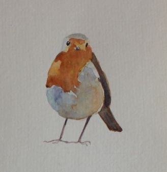
Art by Emma Cownie

The two artworks below, Suburban Cottage and With a Road Running Through It, were created using a minimal style that Emma has been developing over the last 4 years. We asked Emma to tell us a bit more about each piece.

Suburban Cottage by Emma Cownie. Image courtesy of the artist.

Suburban Cottage – “This is an urban minimal oil painting of Sketty, a middle class suburb of Swansea in Wales.  “Urban Minimal” was a deliberate attempt to simplify my paintings in a style similar to the American Minimalists. Much of my work has been influenced by American realists and minimalists. Urban minimalist paintings were painted in accordance with my ‘rules’ for composition and painting:

  • No cars
  • No People
  • Bright light. There must be shadows – at diagonals if possible.
  • Simplified forms – there must be little detail in the final painting. I found this the most challenging ‘rule’ to stick to.

“I wanted to explore the interplay of the geometry of shadows and man-made structures – the tension between the 3D buildings and the 2D shadows, the simplified blocks of colour.”

With a Road Running Through It by Emma Cownie. Image courtesy of the artist.

With a Road Running Through It – “I painted a series of paintings of cottages on the island of Goal, off the coast of Donegal, Ireland. I tried to paint in a style similar to that of ‘urban minimal’. These ‘rural minimal’ pieces pared paintings down to the basics. Minimal texture, simple but interesting compositions, strong light and  shadows, all intended to create a sense of the still, the quiet, a moment in life that is both now and eternal.”

Article by Toby Buckley.

To learn more about Emma Cownie and her work, be sure to check out her website: https://emmafcownie.com. You can read more of her advice about online art sales in her article on Medium. 

Toby Buckley

Read the original article here 

The Net Gallery

Posted on 22 Comments

My top tips & resources for artists

Top tips for Artists_Emma Cownie

I am sometimes asked if I hold workshops or produce intructional videos, and unfortunately, the answer is that I don’t as I am usually busy painting (and blogging). There is so much already available on the internet that I don’t feel I can compete. Others have done it better already!

So I have put together, instead,  a short list of tips and links for any one who is interested to help them develop. Please feel free to comment or suggest your own.  There are no affliate links in this blog. I have included websites and video clips that I have found personally useful.

My Top TEN TIPS

  1. Paint, paint and paint some more. The more you paint, the more your work will improve. Most artists keep a sketch book and sketch and paint in their spare moments. It is important to pratice without worrying too much about the expensive canvas you are painting.  I used to work in oil pastels  on paper  when I was younger but now I try to paint in oils most days.  I have also experimented with water colours and acrylics. It is only by doing and looking that you will develop as an artist


  2.  Look at Art. Decide what you like. Look at the works of many artists. Think about what they are doing and how they do it. You don’t have to copy them but you can be inspired by them.

    Albert Marquet, Fécamp
    Albert Marquet, Fécamp, 1906

    I particularly like pre 1950s artists  (especially post impressionists like Matisse, Marquet, Derain, Bevan, Gilman) for their use of colour and portayal of light.

    The Harbor - Great Spruce Head 1974
    Fairfield Porter The Harbor – Great Spruce Head 1974

    I also like modern American artists such as Edward Hopper Fairfield Porter, Lois Dodd, Peggi Kroll Roberts, Randall Exon, Mitchell Johnson and Jennifer Pochinski.

    Edward Hopper - Hodgkin's House, Cape Ann, Massachusetts
    Edward Hopper – Hodgkin’s House, Cape Ann, Massachusetts

    There are many fascinating interviews with artists on Savy Painter that  are well worth a listen!

    Randall Exon
    Beach House by Randall Exon, 2009

    It is important to see paintings “in the flesh too”.  Van Gogh and Monet need to be seen in real life to appreciate their scale, and how they have used the paint. I once saw a Picasso in Swansea’a Glynn Vivian Museum, and its presence quite blew me away. It was very big. I got a powerful sense of an artist who knew what he wanted to achieve and knew exactly how to do it. If I had just looked at online I would got none of that.  I save  images  of work I like on my  pinterest account.

    Picasso painting Glynn Vivian
    Someone else took a photo of the Picasso and posted it on trip advisor

  3. Paint – buy the best paint you can afford. Try out different brands. A paint may have the same name but look very different depending on the brand. Only buy Artist’s oil paints. The student version are cheaper and inferior. They are fine for underpainting only. They fade. My favourite brands include Lefranc and Bourgeois Extra Fine, Lukas 1862 Finest Artists’ Oil Colour, Sennelier Finest Artist’s Oli Colour, Talens Rembrandt Artists’ Oil Colour, Schmincke Norma Professional Artists’ Oil Colour, Michael Harding Artists’ Oil Colours.  It took me a long time to really understand what colour opacity and the transparency of paint meant in terms of my painting. I am still learning how to use this knowlege.

    Transparency-Oil-Acrylic-em
    Transparency of Oil and Acrylic paint


  4. Canvas – invest in good quality canvas.  I love linen canvas as they are really strong and hard wearing. In my early days,  I painted on cheap cotton canvases that years later would tear easily. It was quite heart breaking to realise that I had wasted my creative energy on an inferior product.

    Loxley Linen canvas (clear gesso)

    I particularly like the natural ones painted with clear gesso. If you buy the white ones, it’s helpful to paint the canvas with a coloured ground before you start painting. Here’s a excellent video on how to do it.

    Cass Art Linen canvases

    They are wonderful to paint on. UK stockists: Great Art, Cass Art, Loxley Arts,  you can also get Loxley Linen canvases at Art Discount and Pegasus Art.


  5. Composition – shapes and how they are arranged,  lines and their direction.

    Henri Cartier-Bresson (1908-2004) Munster, County Kerry, Ireland, 1952
    Henri Cartier-Bresson, County Kerry, Ireland, 1952

    I like looking at how photographers like Henri Cartier-Bresson, Vivian Maier, William Eggleston and Harry Gruyaert used light, colour and composition in their work.

    William Eggleston
    William Eggleston

    “If the arrangement of the big shapes is strong and coherent, it’ll carry the painting. You are 90 percent of the way toward achieving a composition – and consequently a painting – that will work from Mastering Composition“by Ian Roberts

Compositional Guide see here 

Painting of Irish Cottage on Gola, Gweedore
Down to the Pier, Gola by Emma Cownie (Private Collection)

6. Tonal value – The value of a color is how dark or how light that color is. It is easy to see value shifts looking to an image in black and white or in grayscale; it is a little trickier to see it in color.

Tonal values video examples here  

Gray Scale and Value finder
Painting Value Studies with Peggi Kroll-Roberts DVDs
Jana Bouc, Painting Value Studies with Peggi Kroll-Roberts DVDs


Painting of Tenby Harbour
Tonal painting of Tenby Harbour  (Emma Cownie)

7. Colour 

Colour – warmth/coolness of colours and their intensity

Get a Colour Wheel

Colour Wheel


Browns
Brown isn’t on a lot of colour wheels


There is more than way to mix a particular colour. Sometimes its a matter of trial and error. Practice mixing colours and understand why some combinations (the three primary colours for example) result in mud. Mixing “warm” and “cool” colours doesn’t work either. See an explanation here. Remember that brands vary. I have found that  not all “Vandyke Browns” are the the same.

Colour Theory video here 

Van Gogh – used complementary colours in his work to intensify his colours


Some artist restrict their palette, inspired by Anders Zorn

The many shades of the Zorn palette


Notice how the artist holds the brush with paint up against the reference source in this video clip

Compare the paint with the reference

Mixing the exact colour examples here and with acrylic paint here 

Peggi Kroll Roberts – value and colour system 

The Yellow House, Emma Cownie (Private Collection)

8. Simplify, simplify, simplify. Yet don’t forget the details!

Catherine Kehoe
Catherine Kehoe

9. Using Source Material (photographs)  

Don’t be afraid to change what is in the source photos you use, leave out things, simplify forms. Sometimes a really good photo doesn’t make a really good painting. I take photos with the express idea of using them for painting, that means they are not necessarily good photos but they have the information I need.

Peggi Kroll Roberts  – translating from a photo  

Peggi Kroll Roberts, Sharing the Sun

Peggi Kroll Roberts – demonstrates a “high key” painting, where values are kept at a narrow range, in the lighter shades of value.


10. Watch videos and save them – If you want to know how an artist does something, look it up. It might help, it might not. I have found that looking up a technique say “scumbling” is more useful that “how to paint clouds” because I have realised that I have to find my own way of doing something.  I save links on my pinterest account.

Tucson Art Academy Online – lots of short clips 

There is an online gallery/site called Dailypaintworks.com run by Carole and David Marine and daughter Sophie  which runs regular challenges where you can post your paintings along side other artists. They also offer tutorialsArtBytes – Affordable Byte-sized Fine Art Tutorials. Some are free ones as well as modestly priced ones

William Kemp Art Shool offers excellent advice for beginners in oil and acrylics (and a downloaded book on starting acrylics).

How to Paint a Simple Still Life using Oil Paints
How to Paint a Simple Still Life using Oil Paints (Will Kemp)

https://gaborsvagrik.easywebinar.live/registration offers a free webinar


Finally, find your own voice. Forget all of the above points and just create. Don’t copy. By all means steal good ideas. You have to have your own style, like you have a style of hand writing you have a style of painting. Let it develop. Good Luck.

Painting of Early Morning Shadows at Low Tide, Three Cliffs (Gower)
Early Morning Shadows at Low Tide, Three Cliffs (Gower)


Posted on 12 Comments

Hidden Gems (of St Thomas, Swansea)

Hidden Gems by Emma Cownie

Here is a short series of paintings based on the shadows in a backlane in Swansea.  The photographs I used for these paintings were taken a couple of years ago. I came across them in my folder of printed images and decided I wanted revist my “urban minimal” themes.  The light in St Thomas is quite different to that in Brynmill, where I am at the moment.  I don’t know if its because the sea is closer to this part of Swansea, or because Kilvey Hill  has a particular angle of steepness,  but on a sunny day the light is luminescent.

I particularly wanted to used a glazing medium called liquin, to see if I could add depth to my shadows. I first did an under-painting using red ochre and sepia and then used the medium to add colour to shadows.

Back Lane, St Thomas (2021)

Back Lane, St Thomas (Swansea)(2021)

As I grew in confidence I used more liquin medium to paint the drying washing on the line and shadows on the stone wall.

Hung Out to Dry (St Thomas)_Emma Cownie
Hung Out to Dry (St Thomas, Swansea)

I think the darker shadows were more successful than the lighter ones.

Backlane Basketball painting
Backlane Basketball (Swansea) 2021 

I particularly enjoyed the contrast between the neat house with its clean, fresh drying washing and the apparent ugliness of the rough breeze-block wall in the backlane. This painting is very hard to photograph because of the very light and very dark colours. Some part of it end up too light or too dark! I think I got about right but I am still not happy with the final image. Just a reminder that you need to see a painting in real life to really appreciate it.

Too Dark!

Too Light!

A Soft Breeze (St Thoams, Swansea)
Just right? A Soft Breeze (St Thomas, Swansea) 2021

Read more about my Urban Minimal project

My Painting Project: Urban Minimalism

Posted on 18 Comments

Rural Minimalism (Revisited)

Rural Minimalism

My work recently has undergone two small but important shifts in focus.

The first is a compositional one.

I have decided to revisit some of the “rules” I first used in 2017 when painting my Welsh “Urban Minimal” paintings (see my paintings for my exhibition in the Cardiff MadeinRoath festival here).

My “rules” for composition and painting this project were:- no cars, no people, bright light. There must be shadows – at diagonals if possible and simplified forms – there must be as little detail as possible. I want to explore the interplay of the geometry of shadows and man-made structures – the tension between the 3D buildings and the 2D shadows. Simplified blocks of colour.

Urban Minimal Paintings by Emma Cownie
A Selection of my “Urban Minimal” Paintings

I later extended these “rules” to painting the villages of Gower, labelling them (half jokingly) “Rural Miminal” (read more here).

Lately, I have been reflecting on my recent body of work and have realised that many of these ideas got lost in the heady excitment of exploring the new landscape (and skies) of Donegal. Also much of my energy got diverted into recovering from my operation and subsequent recovery after I broke my leg/ankle. I spent several months painting watercolours in my bedroom (as I could not reach my oil paints in the attic)and that led me to think more about composition and simplifying forms.

Watercolour of houses on Gola Island

When I finally made it back to my easel, I could only manage short bursts of paintings so I focused on smaller pieces. The clear blue skies outside my window in Wales may well have influenced my fascination with the weather back in Donegal. Note that my use of colour has changed, they have softened, become more subtle. That’s because both the light and the landscape in Donegal is quite different to Wales. It’s also because I was observing more carefully.

Clouds of Donegal

This brings me on to my second shift. Colour. I was always aware that I played around with colour, brightened them just a little, to create cheerful and vibrant works. For many years I painted cheerful paintings when I, myself, was anything but.

Bright and Cheery!
Bright and Cheery!

Painting saved my sanity after a breakdown and going back to a teaching job that I found stressful. The bright colours were a bit of an emotional crutch, perhaps?  I am not sure.  They may have also been a result of hastiness/laziness, over-confidence  with a dash of insecurity.

My Colour Wheel

But change has been coming for a while. I was aware that I sometimes struggled with getting the colour of distant mountains correct. Often the problem lay in the fact that some of my colours were too strong and they needed softening.

I read somewhere that distant colours needed not blue or purple added into in them (as I had thought) but  it’s complementary colour. That’s the colour’s opposite  number on the colour wheel.

I bought a colour wheel to try and perfect those muted tones and watched a few videos on painting about tone and value. They didn’t really hit home with me.  My colour wheel did not have brown on it, I noticed. I had to look for another one.

Colour wheel with brown

My distant hills improved. I  held my paint brush up close to reference image more often before I placed it on the canvas. I used to only do that occassionally. Now I was trying to do it all the time. Work was slower as I thought and carefully considered my colours.

Painting of Tormore Island from Rosbeg, Donegal
Tormore Island from Rosbeg, Donegal (SOLD)

I saw a video that reinforced this growing fixation with getting colours exactly right.  I saw a video on  artist Mitchell Johnson’s Instagram Stories feed. I don’t know who made the video, otherwise I would include it here. I watched many times. Why was watching this clip so fascinating? I was getting excited about watching paint dry!

The tutor had three pieces of coloured card and he mixed the same exact shades of paint so that the paint seemingly “vanished” into the card. The cards were an acidic green, greyish blue and bluish grey.  The colour combination he mixed were fascinating as he added colours that I thought were not going work and yet in the end they did (often a dab of orange did the trick). I noticed that he was using a small pallette knife  to do the mixing. I ordered some palette knives to mix my paint with too. I have found that I can mix a larger quantity of paint. It means that the colour remains consistent.

The tutor made the comment that his students often asked him “Isn’t this close enough? Will this do?”. “No” he said. That sunk home. I knew I was guilty of thinking “This will do”.  No more.

So I set to combining these two “shifts” in thought. The return to simplified forms and the focus on naturalistic/realistic colours.

My first effort was a large painting of the townland of Maghery in Donegal. One or two houses in the middle distant were edited out to simplify the composition.  We decided to call this “The Polite houses of Maghery” because they have all been built looking away from each other! My husband says he finds this painting very calming.

Painting of Maghery_Emma Cownie
The Polite Houses of Maghery – Emma Cownie

I then revisited Gola Island to simplify my compositions futher. I had to resist the impulse the darken the shadows; to strengthen the colour of the pale pink sky, to add lots of yellow and bright greens to the grass. I think the result is also calming.  It is ever so less frantic and a bit more chilled than my previous paintings of the island.  There are still details, in the tiny reflections and pools of light on the doors and sills. You cannot have colour without light.

Oil painting of Gola Donegal by Emma Cownie
Traditional Two-storey House, (Gola)

Oil painting of Road on Gola, Donegal, Ireland
The Dusty Road (Gola), Donegal, Ireland

I suspect that these paintings better reflect my post-broken-leg state of mind. I go every where slowly and carefully (at the pace of a tortoise, according to my husband). I look at the ground to ensure that I do not trip. I gave up drinking coffee and caffeinated tea to reduce my swollen ankle so I am no longer pepped up on caffeine either. I always am mindful of where my feet are. I am now mindful of my colours too! Slowing down has helped me see colours better.

There are still many challenges to be solved. How will I include clouds in my rural miminal paintings? Will this approach work on a overcast day? Those are problems for another day!

Read more about 

PTSD and my art https://emmafcownie.com/2016/04/ptsd-creates-the-need-to-paint/

Me and watercolours https://emmafcownie.com/2020/04/watercolour-painting-2/

My Urban Minimal paintings for the Madeinroath Exhibition https://emmafcownie.com/2017/11/paintings-of-swansea-2/

The Hollowed Community Exhibition https://emmafcownie.com/2017/10/exhibition-swansea-artist-3/

Composition and my work https://emmafcownie.com/2020/02/the-art-of-the-large-landscape-painting/

Coloir Wheel and Colour Mixing

Read more

Posted on 26 Comments

The Art of Composition (or how to avoid going off at a tangent)

Art of Composition

I have found that my energy is slowly but steadily returning after my operation on my broken leg in March (although painting light is shrinking with the shortening days).  I spent much of the spring and early summer sitting in my chair wishing I could go outside into the fresh air or climb the stairs to my attic studio. I painted watercolours instead, and thought a lot about colour and composition. I learnt to simplify my images and edit them with more ruthlessness than I had done before.

Gola Island
Gola Houses (watercolor)

I have attempted to carry these lessons into the compositions of my oil paintings. I suspect that I need to go further. I am always torn between a desire to accurately convey what is probably a well-known location to local people, and the need to create an effective composition. In otherwords I want to create an engaging painting, regardless of whether a viewer has visited Donegal or not.

Painting of house on Gola, Donegal, Ireland
Blue Door, Gola (oil on canvas) SOLD

Here’s an example of editing my composition. I used several reference photos for this painting of Bád Eddie (Eddie’s Boat) but you will see that I decide to leave out the all the lamp posts. I felt they made the picture look cluttered. I also left out the the skylights on a couple of the houses for the same reason. I did, however, decide to include a couple of series of fence posts on the right side of the painting as they lead the eye down the hill.

Bad Eddie at Bunbeg
One of the reference photos for Bád Eddie at Bunbeg

Painting of Bad Eddie, Bunbeg,Ireland
Bád Eddie, Ireland. (Oil on canvas) SOLD

I have gone further with my editing of the reference image in my most recent painting of Arranmore. This is a painting of a (probably abandoned) white house that I had painted a watercolour of earlier in the year .

Watercolour of Irish cottage, Donegal
The White house, Arranmore, Ireland (watercolour) 

A lot of the compositional work is done when composing the reference photograph, but there is often a bit more tinkering to be done to clarify the image further.

Landscape painting of Arranmore by Emma Cownie
The White Bridge, Arranmore, Ireland (100cm x 65cm) (Oil on canvas)

Here you can see that I have again removed most of the telegraph poles, just leaving one further down the road. The fence posts as usual, get to stay. The ones on the right led the eye down the road. The central part of the painting on the right side is too cluttered for my liking too. It’s very confusing for the viewer. I have since discovered that this is because there are too many “tangents“. The word “tangent” usually just indicates that two things are touching, but in art the term describes shapes that touch in a way that is visually annoying or troublesome. This also describes those telegraph poles I removed. It all makes for an image that is easier to “read”.

Tangent Chart – From emptyeasel.com

I also removed a several of the buildings so that there is a clear view over to the tiny island of Inishkeeragh with its solidary summer home. Finally, I also simplied the pair of yellow buildings to the far right. I found the semi-abstract result pleasing and I felt that the lack of detail balanced the detail in mud, rocks and grasses on the near side to the left of the painting. I like to balance detail with areas of flat colour, such as the roof of the house or the sea, as I think that too much detail all over makes the head sore. The human brain doesn’t process images in this way any way. Our eyes/brains will focus on one or two areas and “generalise” other larger areas of colour.

Thus, I hope I have created a succesful painting rather than slavishly copying a photograph.

White Bridge Arranmore, (in situ)

Read more about avoiding confusing tangents in compositions here  

and also in this article Compose: A Touchy Subject 

or watch this youtube clip

Posted on 18 Comments

Swansea: “The town of windows between hills and the sea”

Swansea: The town of windows between hills and the sea

Dylan Thomas, the poet, grew up in Swansea and he descbed it as “An ugly, lovely town … crawling, sprawling … by the side of a long and splendid curving shore”.

About 5 years ago I went through a phase of painting a number of intricate paintings of Swansea. I loved the layers of Victorian and Edwardian houses with their high pitched roofs.  I went to great effort to walk out onto the quay and the beach to take photos with a zoom lens. The quay is no longer accessible, as part of the walkway has since collapsed.

I recently reworked a couple of these paintings that I still had.

I was recently commissioned to paint another painting from this series. The commissioned work would be similar, but the composition and the execution of the work would be slightly different. I had mixed feelings about the project because I knew how fiddly these paintings are. These paintings take a great deal of concentration!   I use a small brush for all the work on the buildings and they take several days of very focused effort to complete. Still, I hadn’t painted one for many years so I decided to paint one again. Perhaps it’s like a transatlantic flight, something that you can endure once a year but no more often than that. So here it is.

Swansea from the Beach
Swansea from the Beach Revisited (2020 commission)

Still, for all my wingeing I can’t help but say that I was really pleased with the final painting. My head hurts from all that focusing on the small houses with their white gables and red chimneys. However, I did like thinking about the different places in the painting as I painted them. The perspective squeezes the buildings together in a way and makes them look closer to each other in a way they are not in real life, by that I mean, on the ground.

beachfront-cafe-swansea
Beachfront café when it was 360

On the far right of the painting, on the beach, is what used to be the 360 Café and is now called The Secret. Next to that is the green building know as the Patti Pavilion, the trees behind it belong to the beautiful Victoria Park. They look so close to each other but in reality, the Patti Pavilion is on the other side of the busy Oystermouth Road.

Patti_Pavilion,_Victoria_Park,_St._Helen's,_Swansea,_2009
Patti Pavillion and Oystermouth Road

The square building that stretches across the rest of the painting is the Guildhall, which contains the beautiful panels painted by Frank Brangwyn. Rising up behind these buildings is are the parts of Swansea known as Sandfields, Brynmill, and Townhill.

The Brangwyn Hall in Swansea.

Once upon a time, they were villages or rolling farmland, but now they are all merged into the sprawling City of Swansea.  As Dylan Thomas aptly described it “The town of windows between hills and the sea.” On rainy days the clouds descend on Townhill and it can no longer see or be seen!

I am now working on a medium-sized much “looser” Donegal landscape painting, before making a start on two more commissions.


You can now buy a print of this painting here. Click on “reproductions” tab to see your options.


To follow in Dylan Thomas’s footsteps you can visit his favourite places around Swansea:-

https://www.visitwales.com/things-do/culture/cultural-attractions/swansea-and-gower-dylan-thomas-footsteps


Posted on 16 Comments

Tale of two paintings: Reworking a Swansea painting

As a rule, I don’t rework my paintings. Either they work or they don’t. Here’s the exception. This is a large painting (80x100cm) that has hung in my hallway for the past five years. It was for sale on an online gallery a several years ago but for some reason, it was taken off. I am not sure why.

Painting of Swansea by Emma Cownie
Life in the Uplands (2015)

I didn’t really look at it until this summer when it got moved into our bedroom and I looked at it again. I was talking to my mother and sister on messenger/facetime and they saw it on the wall behind me – “Oh, that’s a nice painting” they both called out. “Oh, no that’s old,” I said as if it was a dress I had smuggled back from the shop. Why wasn’t I proud of it? I thought about it. It was an example of my early work when I was going through a phase of drawing lines around everything. I believed this was in the style of the fauvists like Derain and Matisse.

To be honest, it worked at the time but my painting has changed a lot since 2015 and I wasn’t comfortable with those lines. There was no light. I love painting shadows and light and yet there were none in this painting. Curiously, the omission of the skyline helped give a lightly claustrophobic sense of being in a crowded town. That was its real strength. It was a forerunner of my urban minimal series of paintings of Brynmill which culminated in my “Hollowed Community” Exhibition in Cardiff in 2017 (see examples of this series below)

Why had I painted this scene on an overcast day? Why had I cropped it in so tight so there was no sky? I really could not remember. I tried to find the view again. I spent some time hanging out of the windows at the back of our house trying to find the same angle. Eventually, I discovered something similar from the attic window.

View out of my Window
View from the attic

There were a lot more trees. These are the plane trees line that Bernard Street. This road runs from Brynmill uphill to Gower Road, in the Uplands. The trees branches are cut back to stumps every year to control their growth but they burst forth every summer again (See three of my urban minimal paintings below, which feature the trees of Bernard Street).

It wasn’t the only thing that had changed in the last 5 years. Many of the houses had been painted in a different colour. A tin roof towards to centre of the middle (on the right) was now orange with rust. The sunshine also created shadows and changed the colour of many of the roofs.

So I started painting and worked on this when I wasn’t working on commissions. I changed the colour of the chimney pots in the foreground of the painting.

IMG_7037-001
Work in Progress (Summer 2020)

It took some time as I ended up pretty much repainting the whole canvas. The end result was painting with more depth and yet a “lighter” feel. There were still some of those lines but I had reduced them so they did not dominate the painting. I was much happier with this version of Brynmill/Uplands in the sunshine.

Painting of Uplands Swansea by Emma Cownie
Over to Bernard Street, Swansea (2020)

Here are the two paintings side by side so you can see the changes I made.

My next post will be about the paintings that I decided could not be reworked and what I did with them.

Posted on 30 Comments

Back in the studio!

Finally, I managed to scale the steep steps to my attic studio! One step at a time. Holding on the handrails.

Ah, what pleasure it was to be back in the attic. It has a view out the back of the house. It is a great pleasure to look at the wooded parks and hills of West Swansea instead of the unrelenting concrete streets and terrace houses out the front of the house. I have a number of commissions to fulfill but I wanted to “warm up” with some small paintings first as I have been working with watercolours for the past two months. Here’s a selection:-

My first reaction to oil paint was how slow it all is in comparison with watercolours. With watercolours, most of the effort goes into planning and preparation and then the execution of the painting itself is quick. Putting oil paint on the canvas was more laborious that watercolours. I also had to rummage around for looking for the right sort of paintbrushes, a few times. I could not quite lay my hands on what I needed. But,  ah! The paint did what I thought it was going to do. What joy! If I changed my mind about a composition or decided that something did not work I could wipe it off the canvas. It did not reproach me for making a mistake by showing it to the world for ever! Nice!

Anyway, I sat down and started a series of new Donegal paintings. Here they are.

Painting of Donegal Cottage
Wee House on Gola, Donegal (SOLD)

Painting of Storm Clouds Over Inshbofin, Ireland
Storm Over Inshbofin, Ireland (SOLD)

Painting of The Two Tin-Roofed Sheds, Ireland

The Two Tin-Roofed Sheds, Arranmore, Ireland

Painting of house on Gola, Donegal, Ireland
Blue Door, Gola (SOLD)

Landscape Arranmore Ireland

The Old Stone Shed Arranmore Ireland

These paintings are from the past few weeks. I have also worked on two commissions. It has been slow work at times as I often need a lunchtime nap to keep my energy levels up. I do my rehab exercises several times a day which can be very tiring. On a positive note, I finally got to speak to a physiotherapist, Josh, who has been very helpful. He has posted exercises to me and giving me guidance on how much to do.  I can walk upstairs reasonably well, but downstairs one step at a time. When I get tired my ankle gets sore and I limp. I try and avoid that if I can.

What did I learn from watercolours? That I can and should edit and play around with compositions more. I simplified my images as much as I could. I changed the skies or left out an inconvenient house. I found this freeing and I brought an element of this to my oil paintings. For some reason, I have felt to need to be truthful to the real-life locations I painted. I realise now that I don’t have to. I can happily leave out a telegraph pole or a lamp post if it confuses the composition.

What do I miss about watercolours? The tidiness. Clean clothes and hands. The lack of chaos. The speed. The brushes that don’t wear out by the time you have finished a large painting. The lightness. They convey the lightness of birds better than oil colours. Also the convenience, I could pack away all my paper, paints, and brushes in one big bag. I am looking forward to using them outside when I can walk much longer distances!

Emma Cownie Artist
Painting in the studio with my leg up!


Posted on 35 Comments

Watercolour birds

Watercolour painting of a sparrow by Emma Cownie

My left leg and ankle is now at the rehab stage of my recovery (if you would like to know how I ended up with a broken leg you can read about it here). That means I can put partial weight on the leg and I have to do a series of exercises 5 times a day. My ankle is incredibly stiff and my leg is pretty weak from almost 2 months of inaction. When I try to lift my toes, I can feel the plates in my leg. It’s very wierd. It feels a bit like aliens have control of my ankle! The muscles get sore. It’s also very tiring. Actual walking seems a long way off!

In terms of practicality, it means that I am pretty much confined to my bedroom and cannot use my usual oil paints. This is due to the lack of room and the fact that oils are much too messy for a bedroom. So I have dedicated myself to spending this time with my watercolours. I have learnt a lot about the qualities of the different colours and how I can and can’t use them over the past few weeks. I have been frustrated and pleased in equal measure.

In between the exercises, I have been painting birds in watercolours. I have painted many garden birds in oils over the years. I am particularly fond of sparrows. Here’s a selection of my oil paintings to illustrate:-

I have also painted many robins, wrens, blackbirds and a few puffins too!

I have decided that watercolour is a medium that works really well for painting garden birds. It is quite possibly better than oils. Its transparency is particularly well-suited to conveying the lightness of birds. I am experimenting with tight control of the paint versus letting it bleed in parts of the painting. The results of interesting and varied.

Watercolour painting of robin
Robin #1 (SOLD)

I have been trying out different watercolour papers too. My earliest birds were painted on Etival 300g/m (140 lb) rough texture paper. It was what I happened to have in the cupboard.

Out of curiosity, I tried a different make, Bockingford. Their paper is Acid-Free, and archival quality. I tried two weights. First I tried very heavy 425g/m (200 lb) paper, rough texture. I liked the substantial thickness of this paper, and the paintings turned out well enough but the grain of the paper doesn’t photograph well. I might try scanning them instead, when I am finally up and about.

The second Bockingford paper I tried was a lighter 300 g/m rough texture paper. I think that this suited me best in terms of how the paintings look in photographs.

I have ordered some Bockingford 300 g/m cold press (not) texture paper to try out too. That should be coming early next week. So trying that out will come as a welcome break from my rehab exercises!

Stockists

On this occasion, I ordered my paper from Jacksons Art, as they had an extensive range of watercolour paper and paints on offer.

They also stock the excellent M. Graham watercolour paints. It’s not cheap and so far I have one tube of this paint but I love it more than all my other watercolour paints put together!

In the past I have also used Ken Bromley and Great Art.

Rosemary and Co also make beautiful brushes

Please note that I am not being paid to promote any of these stockists. 

Posted on 17 Comments

Watercolour painting

Watercolour painting by Emma Cownie

Watercolours are not usually my thing but circumstances have changed that, for the time being. When I came out of the hospital after my operation to fix my broken left leg, I knew that I going to off my feet for at least 6 weeks. I also knew that it would probably take another 2 to 3 weeks to be fully mobile again. I had all sorts of vague ideas about oil painting again but when I got home I realised that they were hopelessly impractical. My house is full of steep and narrow stairs, so that meant I was going to pretty much confined to my bedroom.

My husband, Séamas, went to a lot of effort to set up the bedroom ready for me. He dismantled the round kitchen table and reassembled it in the bedroom. He also brought up an armchair and two dining chairs for me to sit on and rest my recovering leg on. The table is not very big so that means that the only sort of paint I can hope to use in this limited space are watercolours.

Emma Cownie at her temporary workplace
Organised chaos on the ex-kitchen table

I have a love-hate relationship with watercolours. They are portable and come in cute little boxes but they are the least forgiving of all mediums. If you make a mistake it shows. I used to dabble in them many years ago but I always prefered to use acrylics, oil pastels and oil paints, because with all of those mediums you can scrape back or paint over mistakes. Not so with watercolours. They show you up are the second-rate artist you fear you are!

Cloughcor Cottage Arranmore

In my first efforts with the watercolours I used them in pretty much the same way I always had done.

Whilst I was reasonably happy with the foliage and grass in the picture, I thought the sky was too muddy.

Crug Hywel, Brecon Beacons

I decided I needed some technical help. So I got Séamas to go up to the attic and dig out my tiny Collins Gem book on Watercolour Tips by Ian King. What a marvel this book is!

It has many excellent pointers on mixing watercolour paint, making washes, the translucent nature of some colours, as well as the importance of simplifying the composition.

Four sketches of Table Moutain

So I took these points on board, in particular the importance of simplifying the image. I realised that less is more. It changed what I painted. I was much happier to edit my compositions in a way that I don’t usually in my oil paintings. So I decided to simplify my compositions as much as possible and paint a series of studies of the houses on Gola Island.

I was cautious, however, of unintentionally taking on another artist’s style of painting. I wanted the skills but not the style. I didn’t want to paint like these watercolourists, I wanted to paint my way, but in watercolours. I also wanted to keep the paint as “light” possible to keep the painting looking fresh and airy.

It might sound odd, but I wasn’t familiar with the properties of the colours in my paint-box. Blue watercolour paints act differently to blue oil paints. I needed to experiment and learn how they were different.

In the end, to help me understand what each colour could do I painted each one on a piece of paper so I could look at it when deciding which color to use. This helped me enormously.

93600310_1434552650064840_7917932287902089216_o (1)
My watercolours

I also struggled with how to paint a “simple” wash for some time. One online artist recommended mixing up a lot of paint so that it was “like tea”.  This did not do the trick for me. I was reassured by another artist that washes were actually pretty tricky and some colours were harder to use than others. I found this reassuring. I helped me keep perservering. There’s nothing like someone saying “Oh, but it’s easy” to make you want to give up when it’s not easy!

Eventually,  after a conversation with my mother (who was a keen water colourist), I tried a different brush and also several pots of water. One to rinse my brush in, the others to dip my brush into before I put it in the watery paint mix. That seemed to work for me. I felt slightly more in control of the process and my skies were less lumpy.

I have a long way to go but I am lot happier with my paintings and I hope that I can use these skills to paint “en plein air” when my leg is better it is safe to go outside again, whenever that will be. Until then, I will keep practicing!

I would like to thank Séan Ó Domnhaill for the use of his photographs of the red-roofed Post Office on the Outer Hebrides and the Isle of Lewis.

See my oil paintings here 

For some of the tips on watercolour paintings that I looked at :-Olly Pyle’s

https://www.ourlandscape.co.uk/post/basic-watercolour-kit-where-to-start

I particularly liked Anthony’s site:-

https://watercoloraffair.com/complete-guide-to-watercolor-wash-techniques/

I collect lots of tips on my pinterest page here:-
As well as examples of watercolourists whose work I admire here:-