How to commission a painting. This for all you collectors, decorators, and art enthusiasts who are intimidated by the thought of commissioning a painting, but thrilled at the prospect of working with an artist on a piece of your own. It’s easy.
Here are my 5 steps.
1. The Brief – send me an outline of what you are looking for in your commission; i.e. size, subject matter, and include as many good quality reference photos as you can. I can edit or combine images on request. Here’s an example of a projectwhere I did this last year. If its a pet portrait, what sort of background would you like?
2. Size of the Work – This has a bearing on the price. Here are some guidelines. These prices include free packing & shipping. Most canvas sizes can be ordered to suit commission requirements.
60×50 cm – £295 (Approx 19.68 x 23.6 inches – US $380)
70×50 cm – £345 (Approx 19.68 x 27.5 inches – US $445)
80×60 cm – £450 (Approx 31.49 x 23.6 inches – US $582)
100×80 cm – £650 (Approx 39.49 x 31.49 inches – US $840)
3. Logistics – Timescale, is this work a present for a special event? A custom painting can be a unique gift for a loved one. I will need to know special dates well in advance so there is plenty of time for the work to thoroughly dry before it is packed and shipped.
4. Deposit – I will need a deposit usually 25% of the final price, this is to cover the materials and any design work, such as sketches or other mockups.
5. Final review – You will be sent images of the final painting. I finish my work by painting a neutral colour around the edges so the painting is ready to hang. Your work will be shipped and a tracking number provided.
That’s it. Sit back and admire your painting for years to come.
Get in touch to discuss ideas. Email emmafcownie@gmail.com
My Top 10 tips for selling art online. I am sometimes asked for advice on how to sell art online. To be honest, I feel like there is so much I don’t know about Art marketing, but I did sell over 200 pieces, originals and prints last year and half of these were direct sales to collectors so something’s working. Marketing and selling art takes an enormous amount of time and effort. At least 50% of my day is spent on marketing. The great thing about it all is that the longer you do it the more followers and fans you will gather. It’s an investment of time – but it cuts both ways. You will spend hours at the keyboard, posting away (sometimes wondering if it’s worthwhile) but you will develop a following. Some of it casual, some of it very loyal and dedicated indeed. You need to remember that it may take months or even years of following an artist’s work and career before a collector buys your work. Your fans are invested their time in your you and your “journey” too so you need to keep them with you.
So here are my top 10 tips (BTW there is no affiliate marketing in this blog post and there’s so much more I could say but I’m sticking to 10 tips for starters).
Your story – Be positive. Nothing succeeds like success. There’s enough depressing news out there and your art is (hopefully) an escape from all that unpleasantness. So it’s important to celebrate all your successes no matter how small; every sale, exhibition, painting-in-progress is a cause for celebration. Don’t ever be tempted to say that you aren’t selling or you hate online galleries. Instead talk about your latest project. Explain WHY you make your art. How does it make you feel?
Celebrate where ever you can
Have your own website – don’t build your house on someone else’s land. There are many different hosting platforms out there. There are some that specialise in hosting artists such as artweb, fasco and artmajeur or the very popular wordpress. They will all charge an annual fee (update: Artmajeur’s free plan now allows unlimited artworks to the site). You need to make sure that your site has ecommerce facilities. That means it doesn’t just function as a gallery but also as a shop where collectors can buy work.
Start blogging – a great way to tell your story is to write a blog. I use WordPress but there are other blogging sites like blogger and many websites will have a blog page integrated into the site. Your blogs don’t have to be great long essays but the important thing is to blog regularly. Some bloggers blog once a day, others once a week. Don’t be an occasional blogger. There’s nothing more frustrating than a blogger who only blogs three times a year. You will lose followers if you are inconsistent. Keep focused. Blog about your art and inspiration or art in general. Why do you make your art? How does it make you feel? Don’t blog about the news, your family, what you had for tea, latest fashions unless it’s directly related to art, and what inspires you. Which brings me to…
Be a regular blogger to build an audience
Social Media – there are lots of outlets, Facebook, Instagram, Twitter, Tumblr, Youtube, etc. You don’t have to do them all (I dropped Tumblr, for example as it was a bridge too far) but make sure whichever platform you choose to be, do it well. To honest no one platform is necessarily better than the others for promoting your work, all of them will do something to help. Don’t post twenty times a day – it will seem like you are spamming people and they will unfollow you. Once or twice a day is enough, maybe three times on twitter. Hashtag your own name too #emmacownie so people can follow your work across the platform. The important thing to remember is that it’s called social media for a reason. You have to be sociable. If someone comments on your post it’s good manners to respond, with a “like” and a “thank you”. It’s important that you support other social media users and follow other artists, photographers of any supporters who like, comment on, and share your posts and return the favour. We all need encouragement. It’s important to encourage others. I have made many good friends out there in the online world. Again. like the blogging try not to mix business and personal stuff on your Art pages/sites – have a separate one for your own family stuff and stick to art-related things on your Art accounts.
Not really material for an artist’s Instagram feed
Pinterest – It’s not just for recipes! It has 250 million users every month, with 25 million users in the US and about 80% are female. It’s not a social media platform but a search engine. It’s well worth joining to get your work seen and develop a following. It also a really good source of information about art marketing. I have learnt a lot about blogging, pinning, marketing, and websites from pins on Pinterest. If you want to see a selection, I have saved my Buying and Selling Art pins here.
My Pinterest page
Canva – is great for creating professional-looking blog covers, Pinterest graphics, and so on. I use it all the time. There’s also Pablo and Visme which does some pretty awesome infographics.
SEO– Use Key Words in your posts so that search engines like Google and Safari can find you. A website that is well optimized for search engines “speaks the same language” as its potential visitor base with keywords for SEO that help connect searchers to your site. I find this a vast subject but there are pins on Pinterest and sites like Moz.com will help you improve your SEO. Make sure that when you post your pictures on your website that you filling all the boxes.
Fill in all the boxes
Newsletters – build a list of email addresses on your website. These are your fans, collectors and interested artists. Some collectors watch your progress for years before they buy. This is how you keep them in touch with what going on with you. Not every one uses social media, especially older collectors but they read their emails. Again send out your newsletter on a regular basis, say, every fortnight or once a month. Mailchimp is a marketing platform that offers a free (if your list is under 2000 names) sign up forms and newsletter service. There are others here
Finally, Online Galleries – there are loads and loads to choose from. There is a very long list of online galleries here. It’s a bewildering choice. Some work better than others. There are massive ones like Saatchionline where it is difficult to be seen and smaller ones like Artbazzar that have less of a budget for advertising, there are others that charge to be on them like Artfinder and Artgallery. Others are still free to be on them such as Singulart, but they charge higher rates of commission. It makes sense to have a presence on several sites. Online galleries can be good for sales if they promote you.
Just remember that putting all your energies into one website or social media site is foolish, as it’s like building your house on someone else’s land. They all change their algorithm, pricing policies, curators, and what might work for you one year may not the next. I’ll give you an example, last year Facebook shut down my Emma Cownie Artist Business page with no explanation. This is not uncommon on Facebook. I tried in vain to find out why it had happened and to get it restored, to no avail. I lost thousands of followers and their contact details. I was devasted. That’s not a story I usually share as it’s not a positive one but let that be a warning not to put all your eggs into one social media basket (thankfully, I hadn’t, but it still hurt).
Facebook locks people out of their Business pages
It’s always sensible to be on several platforms and sites and encourage your followers to follow you on different platforms. You can do within many ways such as an email signature with links to your social media platforms. There’s so much to learn and there are plenty of people out there who will offer tempting online courses on Art Marketing but I prefer to teach myself. I hope that this post will help other artists get seen. I welcome any comments, suggestions from other artists or commentators
I warn you now that this is a blog post about paint; about one shade of blue in particular. It might even involve watching paint dry. Which, unless you are an artist, probably isn’t very exciting.
Paints represent a sort of non-verbal language for me. I actually find it hard to put into words how I feel about paints. I have a “feeling” in my stomach and I want to wave my hands about a bit to express those feelings, but it all seems very inadequate. I don’t know if other artists are like this. I see colours in life and think of the paints I might use to represent them on the canvas. There is a particular warm shade of brown that I am yet to satisfactorily find in a paint. For a long time, I struggled with particular shades of green, until I found that mixing turquoise produced the right level “zing” in my summer greens. In Donegal the greens need yellow ochre to make them ring true.
The Madonna’s ultramarine cloak
I am particularly obsessive about a particular colour that until yesterday, I was even sure how it was pronounced. This is phthalo blue. I doubt you have ever heard of it. It’s not like Ultramarine blue, made from lapis lazuli stone, which was was famously so expensive it was solely reserved for painting the Virgin Mary’s cloak.
Now, I am absolutely no good at saying words I haven’t heard someone else say out loud. That “ph” at the beginning really confused me and I used to call it “p-th-al-ff-oo” blue, deliberately tripping over the syllables because I’d never heard it said out loud. Until yesterday, when I realised I could look it up! So it did.
What! It’s pronounced “thalo”!! Why don’t they just call it Thalo Blue? I noticed in the comments below the video that someone else said ” I say it as pfthpfthpfthpfthpfthpfthpfthalo blue”. I don’t recommend, however, that you listen to the Russian pronunciation of “пхтхало блю” on google translate because it’s sort of like my original managling of the word!
Phthalo blue pigments
You are probably thinking, who cares? Well, I care because I am passionate about Phthalo blue. No, that’s not true I am obsessive about it. It is very useful colour in my messy box of paints. I particularly like the version made by French paint manufacturers Lefranc & Bourgeois.
I love you!
It’s not cheap but it a very useful colour. Its very strong. It’s very dark and I love it for creating really dark blues, blues that mixed with Van Dyke Browns and make wonderful dark clouds. I don’t like to use black for dark shades as it has a tendency to “kill” a colour. I have found that its essential for both the massive white Cumulonimbus clouds and the really filthy rain clouds of Donegal. It’s actually a synthetic pigment from the group of phthalocyanine dyes. When it’s mixed with Titanium white it makes a delightful light blue that’s also very useful for skies.
Swirling Clouds Round ErrigalPhthalo Blue with titanium white
Oil paints are in essence pigments carried in oil (once upon a time vegetable oil was used) usually linseed today. The pigments were originally derived from mineral salts, a few from organic materials such as roots. Many of the historical pigments were dangerous, such as the wonderful greens called Paris Green (copper acetoarsenite) and Orpiment (arsenic sulfide), which were highly toxic. Happily, these pigments are no longer used. Later, man-made or synthetic, pigments increased the range of colors available, phthalo or phthalocyanine blue is one of these modern colours.
Chemists first developed this blue pigment in the late 1920s and it was sold under the trade name “Monastral“ in 1935. This list of alternative names is bewildering. Here are some of them; monastral blue, phthalo blue, helio blue, thalo blue, Winsor blue, phthalocyanine blue, C.I. Pigment Blue 15:2, Copper phthalocyanine blue, Copper tetrabenzoporphyrazine, Cu-Phthaloblue, PB-15, PB-36, C.I. 74160. I want to add to this long list of names Hoggar blue. Surprisingly, this colour is also used in Lidl’s Dentalux Total Care Plus toothpaste!
Now, I am sometimes faced with the situation that I have used up all the paint in a tube (and I really do get all the paint out of the tubes) but I can’t read the name or number of the paint to reorder the right one. I might be able to work out the manufacturer but its name or number. Here’s an example of what I mean.
What’s your name?
Still a bit of paint in here!
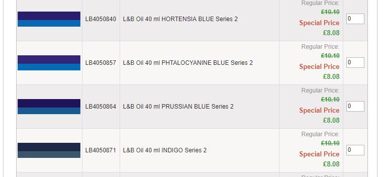
Lefranc & Bourgeois are the oldest artists’ quality colourmen in France. They share the same parent company as Winsor & Newton. This is why, it difficult to get their paints in the UK most stockists carry Winsor & Newton paints instead. A while back they decided to have a rebrand and they changed their labels and the names on the labels. This caused me great confusion because neither of the two suppliers where I usually ordered this great colour listed “phthalo blue” anymore. I’ll show what I mean. Here’s the Lefranc & Bourgeois page from the Great Art website.
So I ordered a Phthalo blue made by another paint maker, Lucas 1862. It was OK but not half as good as the L&B version. It didn’t feel the same, and it didn’t mix with other colours in quite the way I wanted.
Left L&B and Right Lucas 1862
Looking back now, I can see that Hoggar Blue and Phtalocyanine Blue are actually the same colour, phthalo blue. The colour I thought they had stopped making. This meant I spent weeks eeking the last drop of paint out of the what I thought was my last tube, thinking that this colour was no longer to be had in the UK. Then I realised that I had another tube in a drawer so I got it out and studied the label carefully.
All those different names
I realised that the names for this paint in other languages used Hoggar a lot (the Hoggar mountains are in Algiers, once a French colony); Blu Hoggar /Azul Hoggair /Hoggarblau so I went back and looked at the Great Art online catalogue and worked out that my phthalo blue was actually now listed as Hoggar Blue. So I ordered this Hoggar Blue and it was the same colour as Phthalo Blue. I was so happy! It meant that a part of my vocabulary was restored to me and I wasn’t going to run out of words!
So, you can see that I wasn’t exaggerating when I said I was obsessive about colour. Who else but an artist has a celebration over a particular shade of blue? The moral of the story is that all paint is not created equal and it’s always worth being obsessive about colour.
Brooding Clouds Over Errigal
Oh yes, if you want to watch the video about paint drying, be my guest. I have watched and actually found it interesting (OK I actually skipped the drying bit to see the different colours)!
Bunbeg. The word has a pleasing sound to it. It’s short, easy to say and has a nice rhythm to it. Most place names in the British Isles are simply descriptions of locations, or who used to own it. That is not always obvious to modern English speakers because the descriptions originated in Anglo-Saxon, Welsh, Gaelic (Scots) or Gaeilge (Irish). Therefore, when speakers of the Celtic languages use a place name they have a ready made description of the place. It’s the same with Bunbeg. Bunbeg is the anglicised version of “An Bun Beag” which means the “the small river mouth”. I know very little Gaeilge but once you start picking up words you see them everywhere. Beg meaning small – there’s Derrybeg (Doirí Beaga) just round the corner which means small oak.
Bunbeg is located in an area of Donegal known as Gweedore (Gaoth Dobhair), known as a bastion of Irish music, language and culture and home to legendary bands such as Clannad and Altan. If you are as old as me you may well remember Enya’s “Orinoco Flow” which was a hit in the UK way back in 1989 and seemed to be played everywhere. Enya was originally a member of Clannad.
Gweedore is the largest Irish-speaking parish in Ireland with a population of just over 4 thousand people. I enjoyed listening to two fisherman having a good gossip in Irish at Bunbeg harbor round the corner from here. I no idea what they were saying but the conversation went at a good pace. I enjoyed just the sound of the language and comparing it to the sound of Welsh which I am familiar with.
Fisherman (not gossiping) in Bunbeg Harbour“Eddie”
Anyway, back to Bunbeg. The vast tidal sands that stretches across the indent in the coastline is known as Magheraclogher beach. When I say, vast I mean vast. It is one of the best known beaches in Gweedore, largely in part because of the distinctive shipwreck that’s been there since the 1970s.
It is known locally as ‘Bad Eddie’ or Eddies Boat. It has regularly appeared in Music Videos as well as providing the backdrop for countless wedding photographs and instagram posts. That mountain in the distance is Errigal, which also features in countless music videos, photos and paintings.
“Eddie” with Bunbeg and Errigal in the background
Usually photographers shoot him at low tide. Here’s the photo they use on Wikipedia.
Bunbeg – Wikipedia image
I decided to paint a different view of Bunbeg, without “Eddie”, because I liked the reflections of the clouds in the shallows, I thought it made for a more dramatic composition. I thought the rain clouds also gave a better sense of the mercurial nature of weather of Donegal. It was also windy when we were here although, I would say that wind is a pretty much a constant feature of the “Wild Atlantic Way”.
From Magheraclogher Beach (SOLD)
This beach is popular with dog walkers and tourists as it is easily accessible, with a car park. Yet, I say “popular” the other people we saw were dots off in the distance.
For information on the history of Gweedore area click here
I paint commissions. Most commissions requests are pretty standard, say a beloved dog, a favourite landscape or the owner’s house. Some commissions, however, are different. I recently painted two commissions that quite different from the typical paintings of animals/landscapes. My client sent me two images, both were photographs cut out of the New York Times, with little or no explanation. They were both clearly political in nature. I was given free rein to interpret them as I liked.
Suffer the Children
I find these commission interesting as these are not my usual subject matter. I *usually* paint landscapes or observational people portraits. However, in painting these images I am forced to look at them carefully and consider the wider implications of what I am observing. I don’t research the image beforehand only afterwards, I just observe.
The first image I painted was of an internment camp. So with “Suffer the Children”, the tents reminded me of the 1970s medical comedy/satire M*A*S*H which was set during the Korean War. In its early years, M*A*S*H was clearly a commentary on the Vietnam War but later on the Cold War in general. It often questioned, mocked, and grappled with America’s role in the Cold War. It was funny and thought provoking.
I knew that the figures lined up in my source photograph were minors. Teenage boys, I guessed from their size. I didn’t know where they were, but I guessed that they were somewhere in the USA near the Mexican border.
It eventually dawned on me that the white squares on their colourful T-shirts were actually I.D. tags, a bit like those luggage labels evacuees wore during Britain in the Second World War. Turns out that these were teenage boys who had entered the USA illegally. This is, in fact, is a secret internment camp at Tornillo, outside El Paso, Texas. I call it secret because no reporters have been allowed to visit although the New York Times wrote an onion piece on its existence. The photos were presumably taken with a drone.
Internment camp at Tornillo, outside El Paso, USA (New York Times photo)
When I painted this image and shared it on social media there were the usual “likes” but little commentary. Few comments. No one said how terrible it was that children were held indefinitely in these camps, in the “free” west. Or that similar “immigration removal centres“ also exist in the UK, where people, men women and children, are locked up without time limit. Perhaps, they think “immigrants” and then lose interest. Perhaps people missed the satire of the title “Suffer the Children”?
I drew a very different reaction with the second commission. This was a photograph of North Korean leader Kim Jong Un standing on a bridge. I know plenty about the North Korean leader and I think that North Korea must be a dreadful place for its citizens to live in, as they are lied to, starved and any disent is swiftly punished with time in work camps. Also know that that we in the west are told a lot of nonsense about the Korean, such as North Koreans only being allowed a choice of 15 “official“ hair cuts. It all needs to be taken with a pinch-of-salt.
I initially thought this image had been photoshopped. The two figures either side of Kim didn’t look real. In fact they sort of reminded me of a Pink Floyd Album cover, “Wish you were Here”. If you are not familiar with it , it shows of two men in suits shaking hands. One of the men is one fire. As the image was made in 1975, those are real flames. Not photoshopped. Which makes the image especially mesmerising.
Pink Floyd “Wish You Were Here”
As I looked athe Kim Jong Un, photograph I realised that two suited men were his security detail. The image was as “real” as the Pink Floyd one, but also just as staged. All photography and images of Kim have to be officially sanctioned. North Koreans can’t draw or paint him unless they are official state artists.
This photograph, then is how Kim wants to be seen. As a relaxed and smiling leader on a modern railway bridge. There are no ordinary North Koreans in sight on the train platform in the distance. If I was a North Korean citizen, the act of making this painting, however, may lead to me and my family spending time in a prison camp, Hence the title “Wish You Were Here” (no question mark) is ironic.
Turns out that this was a new railway bridge in Gwangwon Province and photograph was taken less than a day after Donald Trump called off his planned meeting with Kim. North Korea had said that Kim was still willing to meet Trump “at any time”, so the title is doubly appropriate.
Wish You Were Here? (Kim Jong Un painting)
Wish You Were Here
When I posted this image on facebook and twitter, hashtagging it #statire, it was met with a storm of outraged comments from people who assumed that it was some sort of endorsement of the North Korean state. I was bemused. I wasn’t expecting this sort of reaction. Is it really very likely that a western artist would paint a fan portrait of a dictator?
There were many outraged comments on how Kim Jong Un killed people in work camps and was an evil man. These came mostly from American and Asian commentators. Interesting, in the light of the fact that Trump’s government imprisons children indefinitely and China also detains muslim uighur peoplein Xinjiang province. I could go on. Hypocrisy is rife. It’s also interesting, it was only British commentators who got the joke or just commented that it was “bizarre”. I’d be interested to see what sort of reaction I’d get if I painted a portrait of Donald Trump or Putin.
There is a long tradition of satire in Britain and Ireland. Although satire is usually meant to be humorous, its greater purpose is often constructive social criticism, using wit to draw attention to both particular and wider issues in society. Hence Jonathan Swift’s famous ‘A Modest Proposal’ which he published in 1729 in which he suggested that the people of Ireland sell their children as food. This outrageous idea was never meant to be taken as face value. Satire is never meant to be taken at face value yet in this social media era things often are, which is why we are all such suckers for fake news, no matter how outrageous it is.
We can scoff at Trump supporters who believed his lies about Clinton and the pizzagate conspiracy but just yesterday a lot of people on twitter in the UK got worked up about a supposed protest by the far right against the new vegan sausage rolls. These sausage rolls had been introduced by Greggs the Bakers. It’s a long story, but a right wing TV commentator Piers Morganhad started the “controversy” when he called the company out on Twitter calling them ‘PC-ravaged clowns’ writing: “Nobody was waiting for a vegan bloody sausage.”
This tweet appeared in my feed yesterday. So as you can see the tweet was “liked” thousands of times and there were many outraged and puzzled comments about how the far right were pathetic and stupid.
Five hours after the original tweet the person who posted it tweeted, backtracked, presumably after realising he’d got it wrong and another tweet claiming it was a “joke” or “banter”, as he called it.
The traditional print media put everyone right, eventually.
Manchester Evening News
So we all need to slow down and think about what we are looking at. Take a minute to see beyond the surface. I’ll leave you with an quote from Jonathan Swift to ponder.
If you are interested in a commission, satirical or otherwise, please get in touch here.
As a Christmas present, I promised I would paint my sister’s cocker spaniel, Dolly. I have a few photos of her but I thought my sister might prefer a painting based on an image she’d chosen.
My sister, however, gets distracted by all sorts of stuff, like the builders arriving to take down her lean-to shed and then having to deal with the junk that has accumulated in the said shed. In her defense, she’s inherited the contents. None of it is hers. There’s a fair bit of it.
Contents of my sister’s ex-shed
Anyway, I am waiting for her to send me her chosen image.
“Dolly won’t sit still when I try and take a photo!”, my sister complains.
So I may be waiting a while!
So in the meantime, I have been practicing painting other people’s hounds. I like to do quick tonal acrylic sketches as a break from oil painting. It challenges to think about tonal value rather than colour. Sometimes, it get it right, sometimes I don’t.
Cocker Spaniel
Goldie
Gilda
I also did a sketch of Dolly from a photo my mother had sent me. It may be the one my sister ends up getting!
Here’s part two of my review of 2018, all the paintings, prints and sketches I have sold via www.Artfinder.com or direct via my own website at www. emmacownie.artweb.com. Quite a few were commissions.
It’s funny to notice the colours I favour in my paintings. When I put together a collage of all the paintings and prints I’d sold in 2019 there some surprises. The greens, yellow ochres and blues are to expected as I paint a lot of coast and woods. The reds and oranges, however, are a little more unexpected as I have this idea that I hardly ever use red in my paintings, unlike my husband who says it’s his favourite colour in his work. The oranges don’t just appear in my urban painting where you’d expect brickwork, but also in the russets of the winter bracken on the Welsh mountains.
It’s not all the works sold as I haven’t included the last two months yet. Watch out on facebook/instagram for an update there. Once, again thank you to all my collectors, supporters, fans, commentators and family who keep me going.
I like to explore nooks and crannies and I usually use a map to help me. This way I can find interesting scenes to paint. I love looking at maps but I didn’t have one in Donegal. I thought I’d get one with the hire car but instead we were given a Stat Nav (Satellite Navigation). You can’t spend hours looking at the lay of the land on a Stat Nav. It spent the holiday in the boot of the car. I thought we’d get one in a filling station but in Ireland you don’t fill up your own car and wander into the garage shop to look at car related stuff and packets of sweet, you have a friendly young chap filing your car up for you! We sort of knew where we were going. My husband, Seamas, had spent hours “driving” down the roads and lanes of Donegal on Street View Google.
The Lone House on Fall Island
So, in the spirit of adventure I turned off the coast road, which runs from the airport to Dungloe, in search of the sea. The roads are narrow but fortunately we didn’t meet anyone coming the other way. After following an undulating single track road, it widened out and then seemingly vanished over a hill into the sea. I didn’t fancy doing a lot of reversing so I parked up to explore on foot. Over the other side of the rise was the beach. It was low tide. The track I’d been on ran down to beach and then started up again on a island on the other side of the beach.
Beach between Fall Island and the mainland
This is Fall Island and it is only 300 metres long. There is only one lone house on the island. The house was shut up for the winter.
The rocky Rosses
I was fascinated by the rocky landscape and the houses perched on the rocks. These rocks are made of granite. Granite is an igneous rock which it was once magma which crystallised as it cooled down. It’s a dense and useful rock. It can be cut, carved and shaped. It is also resistant to water and pollution.
From Fall Island
The granite rocks along the coastline are massive. Monumental. Their edges smoothed by the sea and the wind.
Life as an artist is a very insecure one, you never know where your next sale is going to come from. You can plan and prepare for exhibitions and work on your social media, but it’s impossible to know how many people will see and respond to them.
That’s why it’s really important to take stock, and celebrate the success you have achieved and thank all the supporters and collectors who have helped you over the year; whether it’s a positive comment on a blog post, a “like” on facebook or an instagram post, the sale of a mounted print, a greeting card, a commission or the sale of a painting. They all help keep me going! You may not believe it, but artists have fragile egos (this one has, anyway) and they need encouragement, especially if they venture off into new directions, as I so often do.
Here’s a review of some of my sales of paintings and mounted prints from the first part of 2018. Many were sold via the online gallery Artfinderbut increasing I have sold direct via my own website. Each painting is a unique work. I don’t paint generic people or landscapes. They are all real people and locations. In April’s collection you can see many of the Gower painting I did as part of the Gower Coastal Path Project. Bloggers’ comments and encouragement really helped me complete that project. Thank you, all.
January Sales 2018February Sales 2018
March Sales 2018
April Sales 2018
My next post will complete the review. Thank you to the brilliant people who have supported me and bought my work this year, I couldn’t do it without you!
We are back in South Wales and have been getting out and about taking photos, especially with a drone. This will help enhance composition in my landscape paintings of the Gower Peninsula.
It was freezing cold but the birds were very busy. There is a sign near by asking people not to feed the birds but the locals take no notice (note the bird feeder). I am glad because I loved watching the birds, especially the tiny coaltits. My camera work isn’t much good but at least you know its real and AI generated slop.